Cross-Platform Slot Design: 5 Things That Break on Mobile
A slot game that plays beautifully on a studio monitor faces a very different test on a player’s phone, and that gap is what cross-platform slot design has to close. The screen is smaller, a thumb replaces the cursor, the hardware is often mid-range, the phone is usually held upright, and the mobile build may need its own certification.
Most slots are designed on desktop first and adapted for mobile afterward, which is why these differences work best when they’re planned deliberately, ideally before the first design file opens.
This article walks through the five areas that most often break on mobile: sizing and spacing touch controls, scaling animation across devices, designing a dedicated portrait layout, keeping brand identity consistent across displays, and defining certification scope for both platforms.
On mobile devices, the controls designed for a cursor tend to be too small and placed too near to one another. As a result, players often tap the wrong button, alter a bet they didn’t intend to, or have to tap twice, making the game seem clumsy.
A mouse cursor lands on a single pixel. A thumb covers an area roughly 10 mm wide and usually lands slightly off from where the player aims. Mobile slots UI needs to be designed around that contact area, not just around how the button looks.
Minimum Touch Target Sizes
System guidelines provide a reliable standard. Apple suggests that tappable areas should be at least 44×44 points, and Google’s Material Design recommends a size of 48×48 dp with approximately 8 dp between the targets. The visible icon may be smaller than its tappable area, provided that the hit area surrounds it. The spin button, which is pressed hundreds of times during each session, typically exceeds the minimum size.
Building a Control Hierarchy
The slot interface includes the ability to spin, the bet amount, the balance, autoplay, the paytable, sound, and sometimes turbo or buy-feature buttons. Since all of these elements rarely fit completely within the full touch space available along the phone’s lower edge, the casino’s user interface layout begins with a priority order:
- Primary: spin, bet adjustment, balance, and win display, always visible
- Secondary: paytable, game rules, sound, and settings, grouped into a menu
- Contextual: autoplay or buy-feature, shown only in markets that allow them
The lower third of the screen is the most accessible section when using one hand, which is the reason why the spin button is located there. The bet controls are positioned far enough from the spin button that a sliding thumb cannot change the stake during a session.
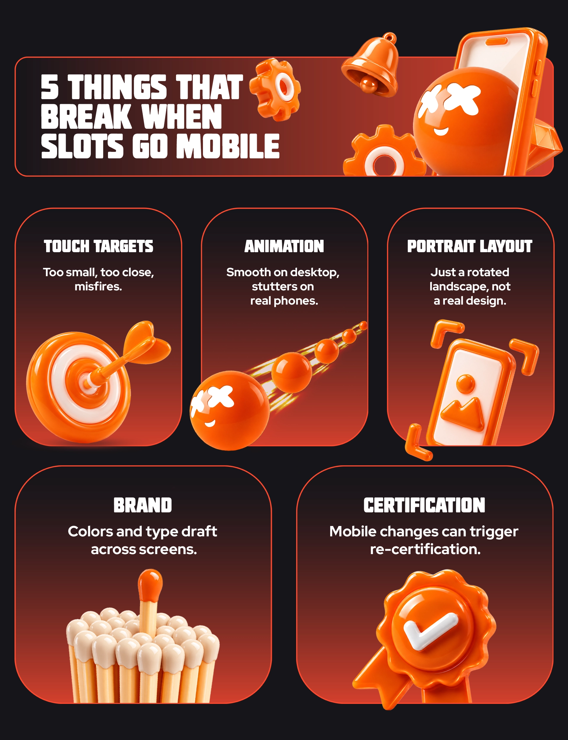
Animations that appear cinematic when run on a studio machine tend to stutter on the phones that players actually use, with the Reels dropping frames, the effects lagging behind the sounds, and the big-win moment ending up feeling broken rather than exciting.
Smooth animation requires the device to draw each frame within a very short time period. High-end phones are able to handle intensive animation without any problems. Mid-range and low-end Android phones, which are the ones that many slot players use, have weaker graphics processors and less memory, so the same animation can lag and cause the reels to appear jerky.
What Makes Slot Animation Heavy
- Particle effects: coin showers, sparkles, and win lines can put a huge number of moving elements on screen at once
- Overdraw: stacked transparent layers make the graphics processor paint the same pixels several times
- Texture memory: large uncompressed symbol sprite sheets fill memory and trigger reloads
- Shader effects: live blur, glow, and bloom are expensive on mobile hardware
Planning Big-Win and Bonus Sequences
The big-win festivities and the free-spin openings are generally the most elaborate animations in a slot game and occur at the times when players are most excited. A version using fewer coins and running smoothly is preferable to one that is more detailed but stutters. When the sequences are designed for both tiers from the very beginning, the reward remains consistent on all devices.
When portrait is treated as a rotated landscape layout, the reels shrink, symbols lose detail, and the bet panel gets pushed wherever it fits. The online casino game technically works upright but feels cramped and unplanned.
Modern phones are tall and narrow; when held in an upright position, they have notches, camera cutouts, and gesture bars along the edges, which is quite different from the wide landscape frame that most slots initially have.
Reel Grid and Symbol Size
When a standard reel grid is reduced to a portrait width, each symbol becomes small. To make up for this, slots that start in portrait orientation use bolder symbol artwork and simpler silhouettes, make use of a reel area that occupies more vertical space, or adopt grid formats designed for tall screens, such as cluster or tumbling-reel arrangements.
Bet Panel and Paytable Placement
Usually, the bet panel in a portrait orientation moves below the reels and enters the area that is accessible by the thumb, making room at the top of the screen for the game logo, the jackpot indicators, and the win counters. Instead of appearing as an overlay, the paytable becomes a scrollable full-screen panel.
A slot’s look can quietly shift on mobile: colors turn flat, small text becomes hard to read, and characters lose their expression. The game still works, but it starts to feel like a cheaper version of itself.
Casino brand identity in a slot lives in its art direction: the logo, symbols, characters, and color. That art is usually approved on calibrated desktop monitors, while players see it on phones with different display technology, size, and brightness. Since the same game often appears inside many operators’ lobbies, it also needs to look consistent next to each casino brand that hosts it.
Slot’s Color Palette on OLED and LCD Displays
OLED screens produce deeper blacks and more saturated colors; many budget LCDs look flatter and cooler. Some phones also display a wider color range than others. Exporting assets in a standard color profile and checking the slot’s color palette, especially high-value symbols and win highlights, on both screen types keeps it recognizable.
Character Design at Phone Size
Fine detail disappears at small sizes. Strong character design for mobile relies on clear silhouettes, thicker outlines, and exaggerated expressions, so mascots and premium symbols stay readable at a fraction of their desktop size.
Testing on a Device Matrix
A device matrix is a pre-determined list of actual phones and tablets that includes a range covering high-end, mid-range, and low-end models, as well as those with OLED and LCD screens and different screen shapes. By looking at the artwork on these devices rather than using a resized browser window or a simulator, it can be confirmed that the casino’s brand identity remains intact and that the mobile version of the game feels identical to the original.
It is often only discovered later that the certification for the desktop version does not include the mobile version, and UI modifications carried out during the adaptation process can lead to the need for re-certification, which delays the launch in more stringent markets even though the build has already been completed.
Before an online casino game is launched in a regulated market, an accredited testing laboratory has to examine its mathematical formulas, the random number generator, its RTP, and the fact that it complies with the relevant local rules. The fact that approval is linked to a particular version means that a separate mobile version or major changes to the user interface might have to be submitted again.
Single Build or Separate Builds
A single responsive build is certified once and maintained as one codebase. Separate builds allow more platform-specific design but add testing time and cost per market. Choosing before design starts lets the schedule and budget reflect it.
UI Features That Are Regulated
Some features look like pure interface choices but are rules in certain markets. In Great Britain, for example, the UKGC bans autoplay and quick-spin features, sets a minimum spin duration, and requires players’ net position to be displayed. Other jurisdictions regulate how responsible gambling features appear and behave, including:
- Autoplay limits and stop conditions
- Reality checks and session reminders
- Clock and session time display
- Balance visibility
Marking these in the brief lets designers build each version within the target markets’ rules from the first draft.
Bring your game ideas to life with Betboyz. Our creative team designs engaging, visually stunning games tailored to captivate your audience.
The design of slot games for various platforms is mainly a matter of timing; once decisions have been made regarding orientation, the devices to be used, the different levels of animation, and the scope of certification, each version can be designed from the outset for the screen on which it runs.
Scoping a cross-platform build or partway through one? BetBoyz designs slots mobile-first across the full device matrix. Send us the build or brief you’re working on, and we’ll show you where to focus.