The Complete Guide to Crash Game Design: Mechanics, UX, Math & Brand
Crash games occupy a distinct position in modern online casinos. The mechanics work differently from slots, the UX follows its own logic, and the math sits in a different place. As a format, they’ve developed their own design language, one that doesn’t map cleanly onto the conventions of other game types.
The category has matured fast: what started as a single Bitcoin experiment now spans dozens of studios, distinct visual identities, and its own compliance conversations, yet most write-ups still treat it as a footnote to slots instead of a discipline with its own rules.
This guide covers how crash games are actually designed, from the ground up.
A crash game is a real-time multiplier game where players bet before a round starts and decide when to exit as the multiplier climbs, knowing it will stop at a random point and take any remaining stakes with it. Rounds last 5 to 30 seconds and layer randomness, timing, and visible social pressure into a single decision.
Bustabit launched it in 2014 as a bare Bitcoin gambling experiment, no theme, almost no UI, just a rising multiplier and a button. It stayed niche until Spribe’s Aviator in 2019 packaged the same mechanic for mainstream operators, added visible multiplayer elements, and gave the category its commercial form.
What made it stick: the outcome is visible as it builds, rounds are short enough that the next one starts before the last fully settles, and other players’ cash-outs appear on screen in real time. That social layer is something slots don’t have, and it’s not incidental; it’s structural to the format.
In a portfolio, crash sits in instant-win alongside plinko and dice. Operators who shelve it next to slots tend to merchandise it incorrectly. The player arriving at a crash game is looking for something different.
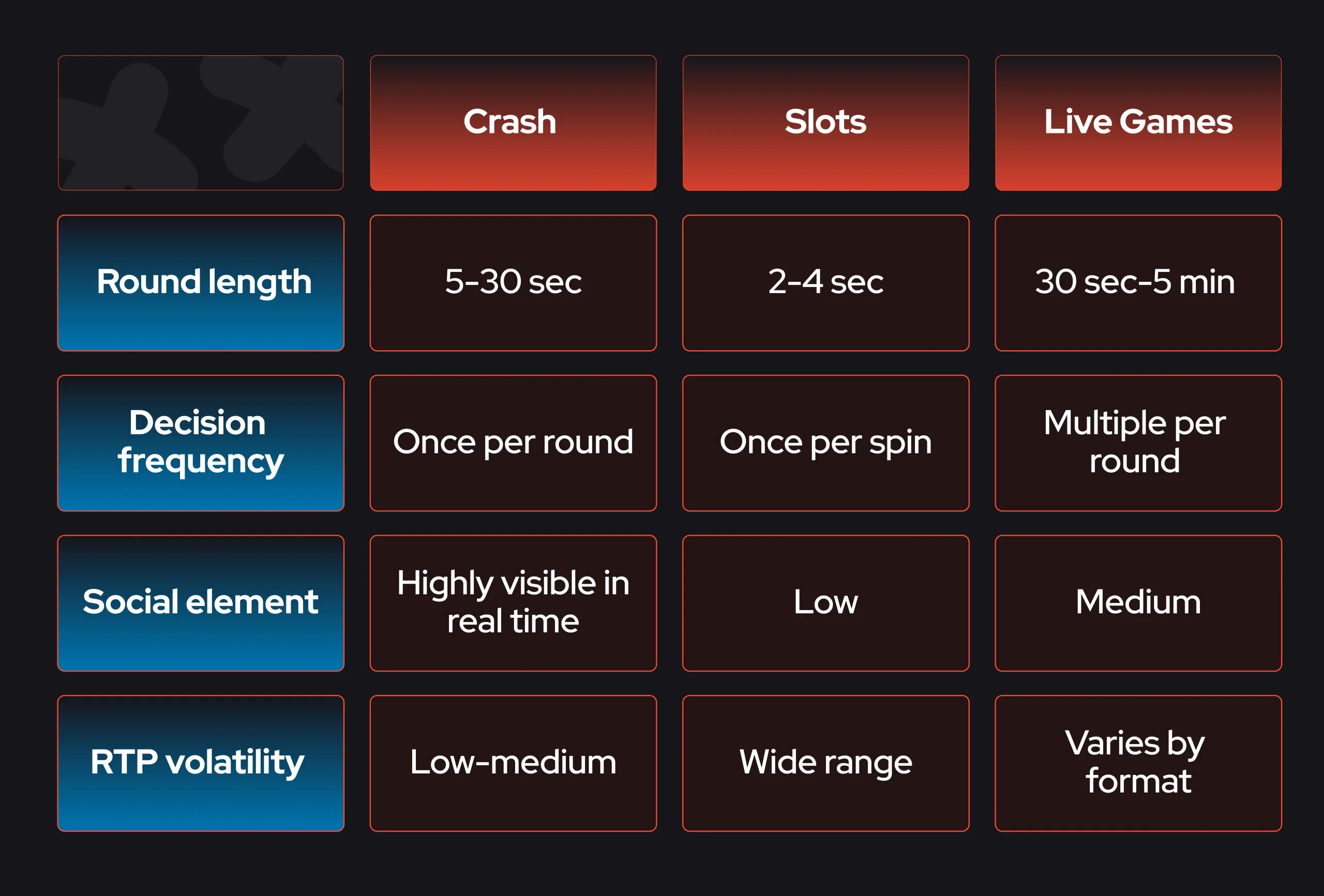
A crash round moves through four distinct phases: betting window, takeoff, climb, and crash. The multiplier is determined server-side before anything is visible to the player, then disclosed in real time as the curve rises. Cash out during the climb and the multiplier locks in; stay in through the crash, and the stake is gone.
- Betting window: typically 5–7 seconds. Bets are open, the previous round’s result is still visible, and the UI shows what other players are staking. This is the only moment of calm in the round.
- Takeoff: bets lock, the curve starts moving. No new entries from this point. The transition needs to be unambiguous; players have to know exactly when the window closes.
- Climb: the multiplier rises. The curve shape varies by game: linear climbs are predictable, exponential ones build tension faster. Most production games use a hybrid. This is where the cash-out decision is made, under real-time pressure.
- Crash: the round ends. Players who cashed out above this multiplier win; everyone else loses their stake. The crash point was set before the round started. The curve was always going to stop here.
- Settle and reset: results post, the history strip updates with the latest multiplier, and the betting window opens again. That history strip matters more than it looks: it’s the primary reference point players use going into the next round, even though it carries no predictive value.
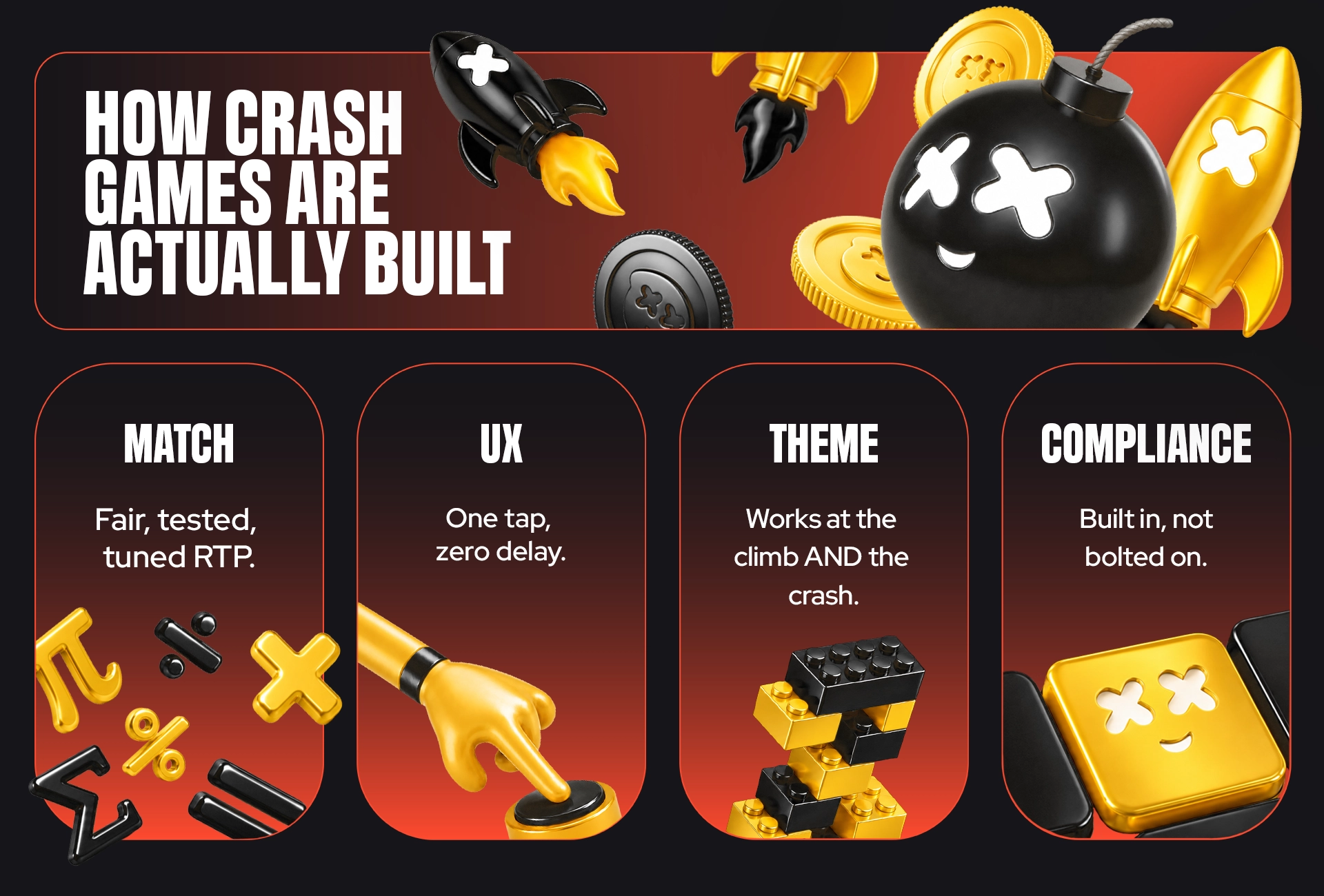
Every crash game round ends at a number set by math, a probability distribution that makes low multipliers common and high ones rare. This is tuned to a target RTP of 97–99%, so the casino keeps just 1–3 cents per dollar bet. That beats slots, which typically run at 95–96%.
Part of that is structural: crash games use provably fair systems, so players can verify the math themselves, making it harder to quietly lower the RTP.
Most rounds end early. That’s not a glitch; it’s how the house edge works. Big multipliers happen, but early crashes are what the casino counts on.
Provably fair
Three things make it work: a server seed created before the round starts, a client seed the player can influence, and a hash function that locks them together. The result is committed before anyone plays and can be checked after. You can verify that nothing was changed mid-round.
Good crash game design adopted provably fair systems earlier than most game types, and it makes sense. When players watch a multiplier rise live, they naturally expect to be able to verify the outcome too. Transparency here should be a part of what the format promises.
Volatility levers
RTP isn’t the only thing designers can adjust. The curve shape (how fast the multiplier climbs) and the crash distribution (how crash points are spread) both change how the casino game feels without touching the underlying return. A steeper curve makes early crashes feel more sudden. A distribution skewed toward lower multipliers means players bust more often, even if average returns stay the same.
A design responsibility
The history strip of recent multipliers is a useful casino UI. Players pattern-match on results that carry no predictive weight, and the design team is closer to that problem than anyone else on the project. How the history strip is presented and what it implies is a responsible gambling decision, not just a layout one.
Crash UX has to do three things at once: communicate a fast-changing multiplier with zero ambiguity, give the player a single high-stakes action (cash out), and make the social context visible. Done right, every player can see their bet, the curve, the cash-out button, and what other players are doing at a glance.
The four UI zones
Every crash game organizes around the same four areas: the betting panel, the curve display, the cash-out button, and the social and history strip. The hierarchy matters: the curve and the cash-out button have to dominate. Everything else is context.
The cash-out button
One tap, no confirmation modal. The window between a winning cash-out and a losing one can be a fraction of a second. Any friction in that interaction, like a confirmation step, a laggy response, or an undersized target, costs players wins and costs the product retention. The button is the casino game.
Auto controls
Auto-cash-out and auto-bet exist for players who want to set a strategy and remove the real-time pressure. When to surface them is a UX decision: visible by default, and they flatten the tension the format is built on; buried too deep, and engaged players can’t find them. Most production games land on a collapsed toggle that’s accessible without being prominent.
Mobile-first
The cash-out button needs to sit within thumb reach in portrait mode. High-pressure moments and awkward button placement don’t mix. Players who miss a cash-out because of the UI layout don’t come back. Landscape vs. portrait handling, button sizing, and tap target margins all need testing under realistic one-handed conditions.
Sound and haptics
The climb gets a low, building tone. The crash gets something sharp and definitive. The logic is the inverse of a slot win sound. Here, the audio is tracking tension, not reward. Haptics follow the same principle: subtle during the climb, distinct at the crash point. Neither should be decorative; both are functional feedback.
Deliver seamless gaming experiences with intuitive UI/UX design. Betboyz ensures user-friendly interfaces that keep players engaged and satisfied.
A crash game’s brand theme carries more weight than a slot game’s because the mechanics are nearly identical across the category. Aviator is a plane, Spaceman is an astronaut, JetX is a jet. The math underneath is the same. What separates them is the world built around it, and whether that world holds together across UI, sound, and animation when the pressure is on.
The rising-thing problem
Most crash themes converge on something that goes up like planes, rockets, cars, or coins. That’s not a coincidence; the rising curve needs a visual metaphor, and the obvious ones get taken fast. Escaping that pattern requires either a strong enough casino brand to carry an abstract theme or a concept where the “rise and fall” reads dramatically rather than literally. A crashing plane is grim. A crashing rocket is cinematic. The difference is intentional framing, not luck.
Does the theme survive the crash?
That’s the functional test. A theme that looks compelling on the climb but lands badly at the crash point has a problem that the art team can’t fully solve. The crash moment is high-emotion; it needs to feel dramatic or even darkly funny, not deflating. This gets pressure-tested in concepting, not after assets are built.
Branded crash games
Some operators bring their own casino brand into the crash format using house visual identity, mascots, or licensed IP as the theme. It works when the brand has enough recognition to add value, and the visual language fits the format’s energy. It doesn’t work when the brand is corporate, and the crash moment undercuts it. The decision is worth making explicitly rather than defaulting to it because it seems efficient.
Identity decisions that compound
Character design, naming, and color language all carry into how the game sits within the broader iGaming brand. A crash game isn’t an isolated product; it appears in lobbies, in promotional material, in app store listings. The theme has to work at thumbnail scale as well as full screen, and it has to fit next to everything else the operator is running.
Bring your game ideas to life with Betboyz. Our creative team designs engaging, visually stunning games tailored to captivate your audience.
Crash games generate faster betting decisions than almost any other casino format, which makes responsible gambling design more consequential, not less. Session limits, loss alerts, cooling-off prompts, and clear odds disclosure need to be present from day one: visible enough to function, integrated well enough not to break the gameplay experience.
Pace as a regulatory signal
Short round length draws regulatory attention in a way that longer formats don’t. Markets including the UK, Sweden, and Ontario have tightened requirements around fast-format games. The UK Gambling Commission and Ontario’s AGCO have both issued guidance that affects how operators deploy instant-win products. Crash sits squarely in that category, and compliance review is increasingly happening at the design stage, not after certification.
RG tools that fit the format
The principle is that responsible gambling tools need to be present within the game’s natural sightlines, not added as an afterthought or hidden where only motivated players find them. The cash-out button is the player’s primary focus; RG information needs to live close to that hierarchy, not outside it.
Presenting history honestly
The multiplier history strip is a useful context. It’s also the part of the UI most likely to imply a pattern where none exists. How it’s displayed. The number of results shown, whether any are highlighted, and how it’s labeled affect whether players read it as data or as a signal. Regulators in several markets are paying attention to exactly this.
Building for compliance from the start
Retrofitting RG features after a game is built is expensive and often visible; bolted-on tools look bolted on. iGaming studios that design compliance into the product from the concept stage ship cleaner games, clear certification faster, and avoid the revision cycles that push timelines out. It’s not a constraint on design; it’s part of the brief.
The work spans math and provably fair logic, server-side engine, client UI, art and animation, sound, and certification, and these tracks run in parallel, not in sequence, for any realistic timeline.
The five stages
| Stage | What happens | Where it can get stuck |
| Concept | Mechanics, theme, and math model agreed | Scope creep; theme changes after sign-off |
| Math and provably fair logic | Crash distribution, RTP, and seed logic designed and reviewed | Ambiguous spec; late RTP target shifts |
| Engine | Server-side game logic built to math spec | Technical debt from a loose stage-two spec |
| UI, art, and sound | Client built in parallel; motion, sound, and responsive layout resolved | Theme decisions that don’t survive real assets |
| Certification and launch | RNG certification and compliance review with an approved testing lab | Lab queue; RG features not built to spec; incomplete documentation |
Crash game design isn’t complicated once the format is understood on its own terms, but it doesn’t forgive shortcuts. The math, the UX, the theme, and the compliance layer all have to work as a single product, not a stack of separate deliverables. Studios that treat them that way ship better games, clear certification faster, and build something that holds up in a category that’s still moving quickly.
Need a crash game design to look fresh and unique?
BetBoyz builds design and the brand into one coherent product.