BetBoyz Highlights: Stand Design Impressions from SBC Lisbon
The Boyz walked SBC Lisbon with a clear brief: separate stagecraft from strategy, and impressions from impact. Because God forbid we confuse a shiny arch with a solid idea. These events are always a showcase of how online casino brands express themselves, both visually and strategically. For us, they serve as an inspiration ground: what works, what doesn’t, and what fresh ideas stand designers and marketers can take home.
Among dozens of pavilions, a few stood out for their strong and catchy choices. We were impressed where it mattered, and specific throughout.
Here are some that caught our eye for very different reasons.
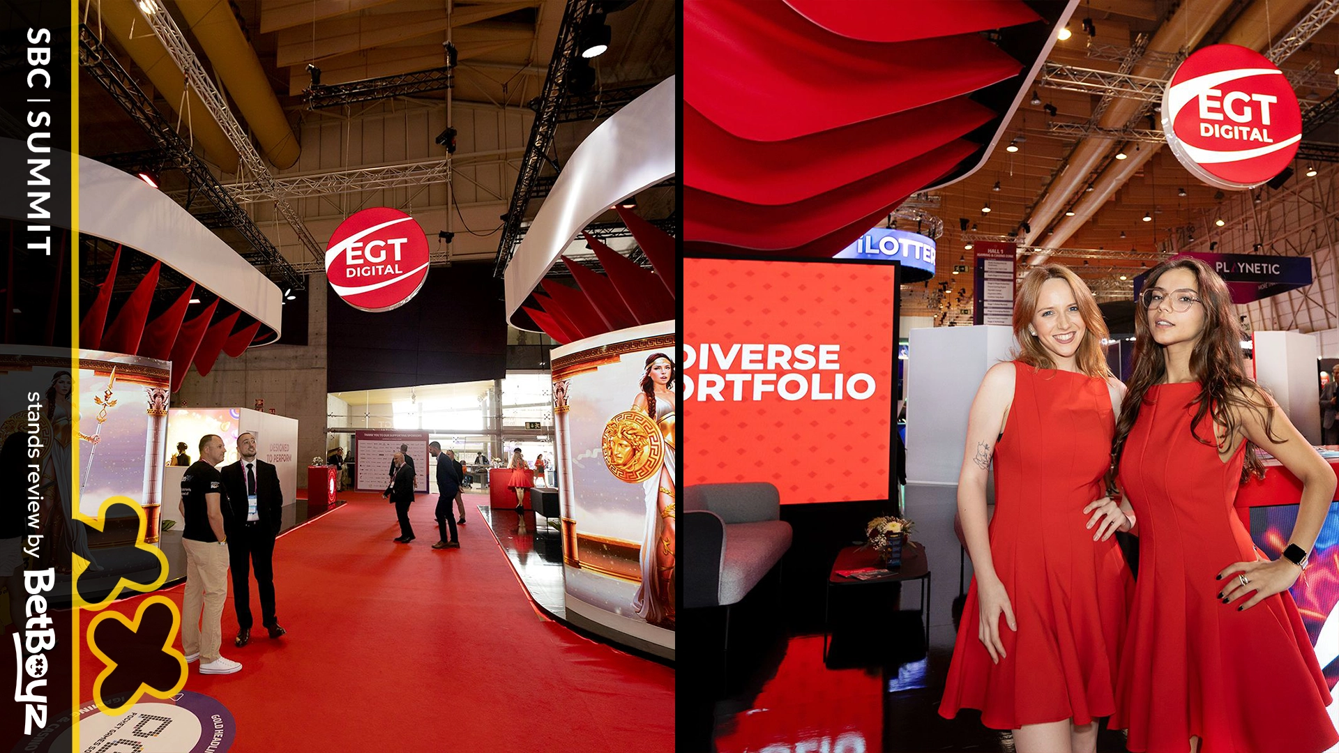
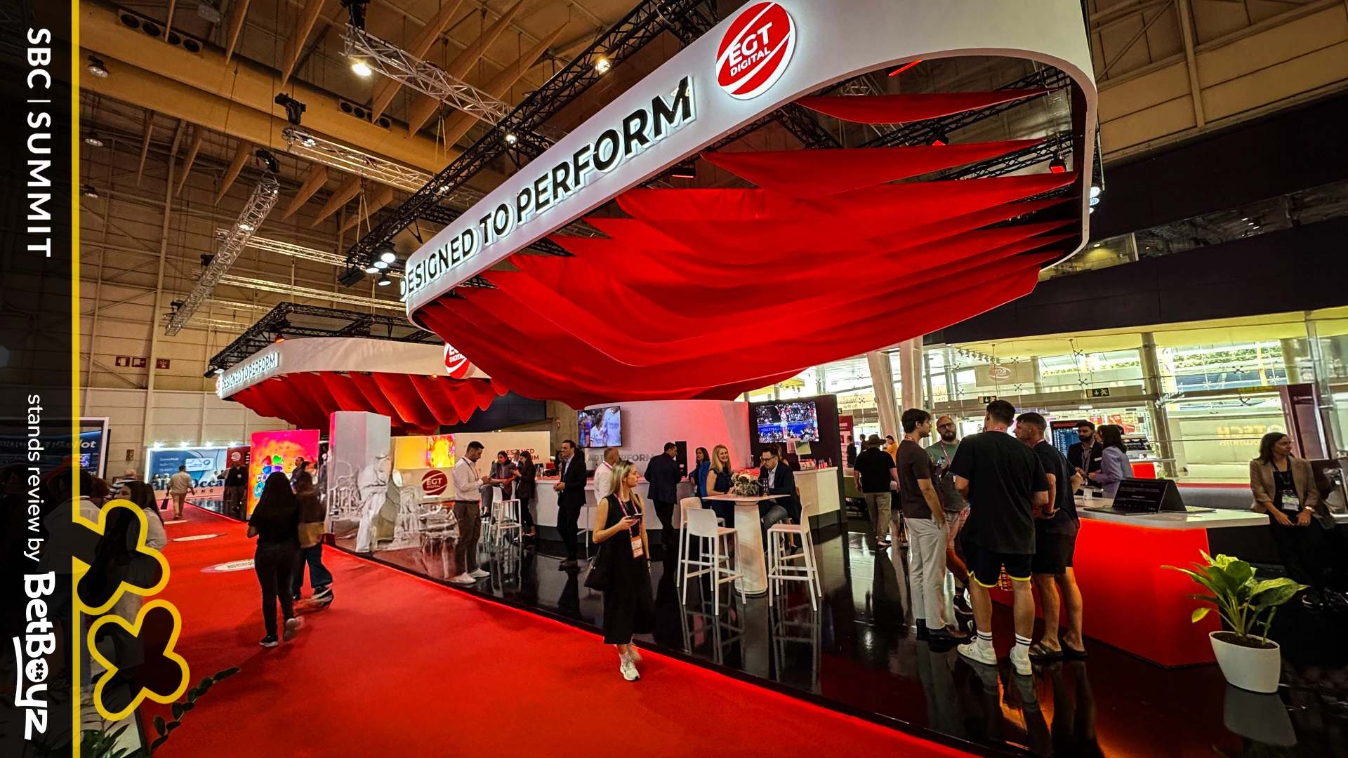
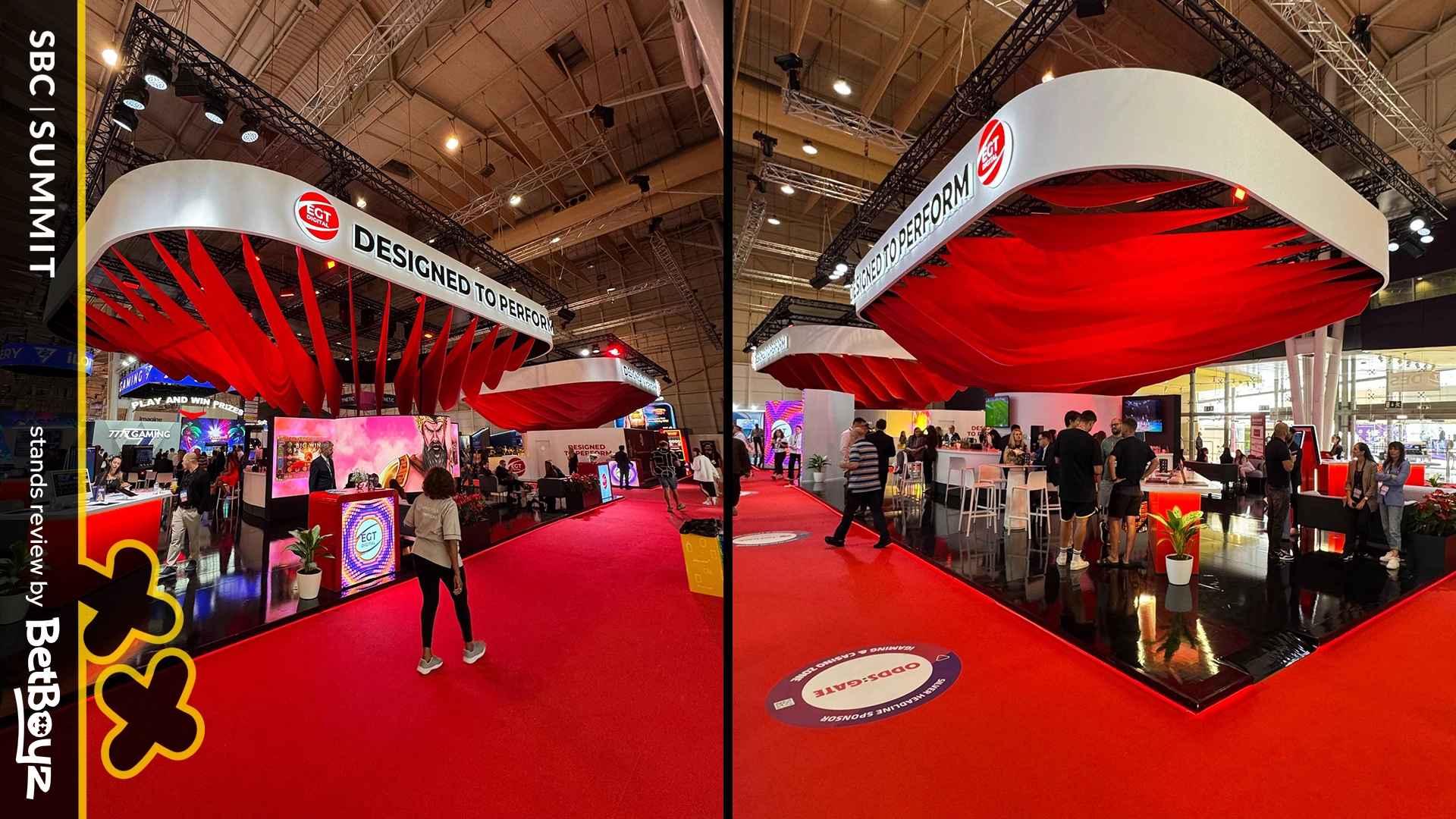
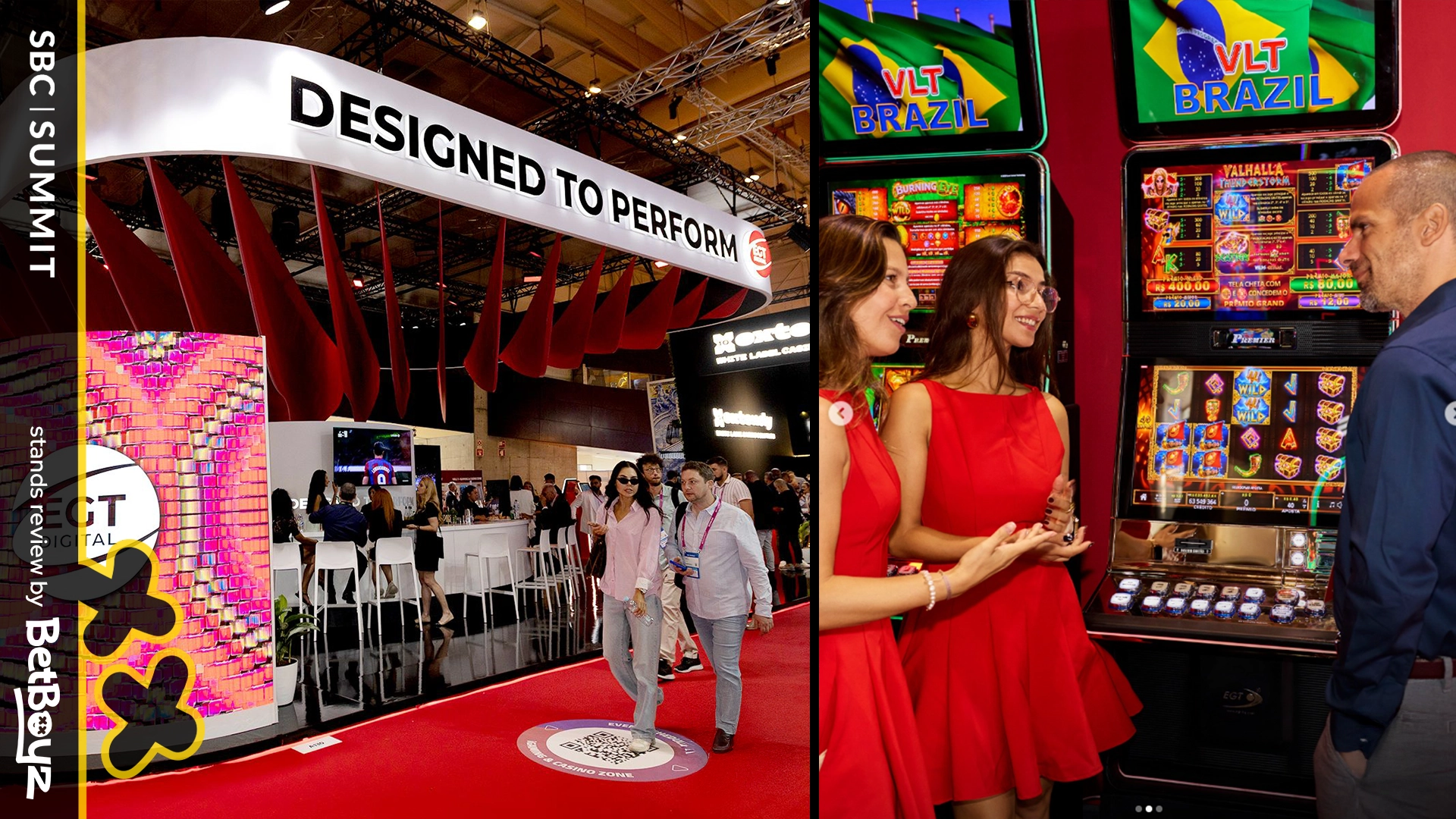
EGT Digital went bold with their pavilion. The first thing you notice is the giant hanging red element, a flowing structure that echoed parts of their casino logo without depicting it directly. It worked as a dominant centerpiece, immediately catching the eye from the right angle.
Placed close to the exit, the design even interacted with the environment: whenever the door opened, a breeze set the fabric in motion. Free moving art, thank you, AC. This unintended effect gave the stand a sense of life and movement, making it more memorable than a static décor piece. It showed how even small environmental factors can amplify the impact of a stand if the core design is strong. Note the order: strong idea first, lucky wind second.
But the solution required some sacrifices. From certain angles the red element was less visible, making it most impactful when approached head-on. Still, as a bold move, it delivered presence and brand recognition.
What’s interesting here is that EGT embraced the principle of focal dominance: one strong element that controls the space. In iGaming expo stand design, that can be a winning strategy. Otherwise, the “wow moment” risks becoming too situational.
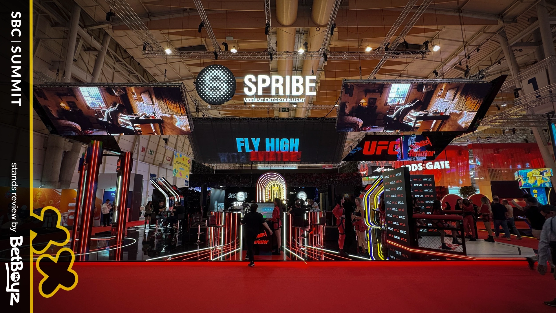
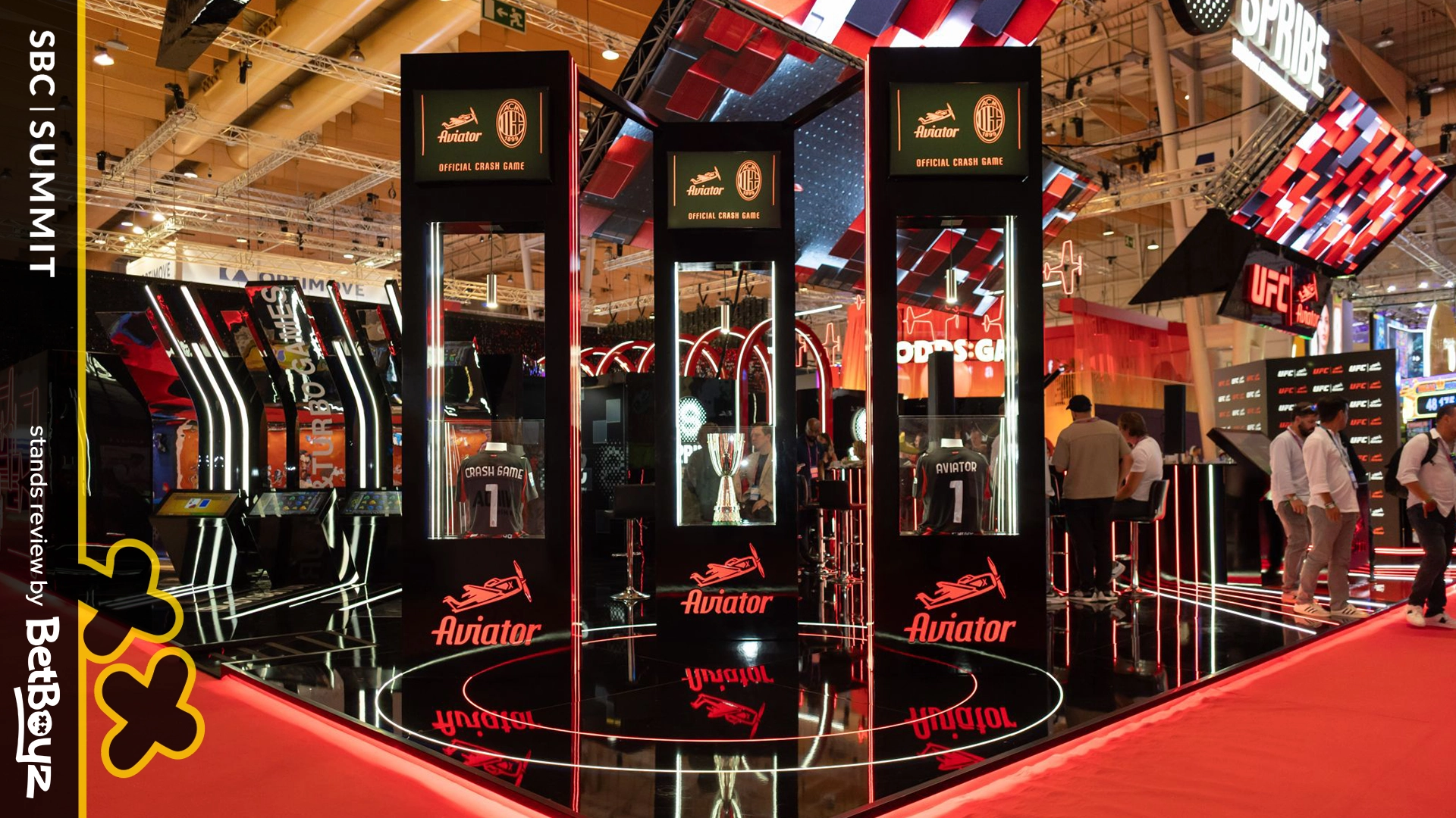
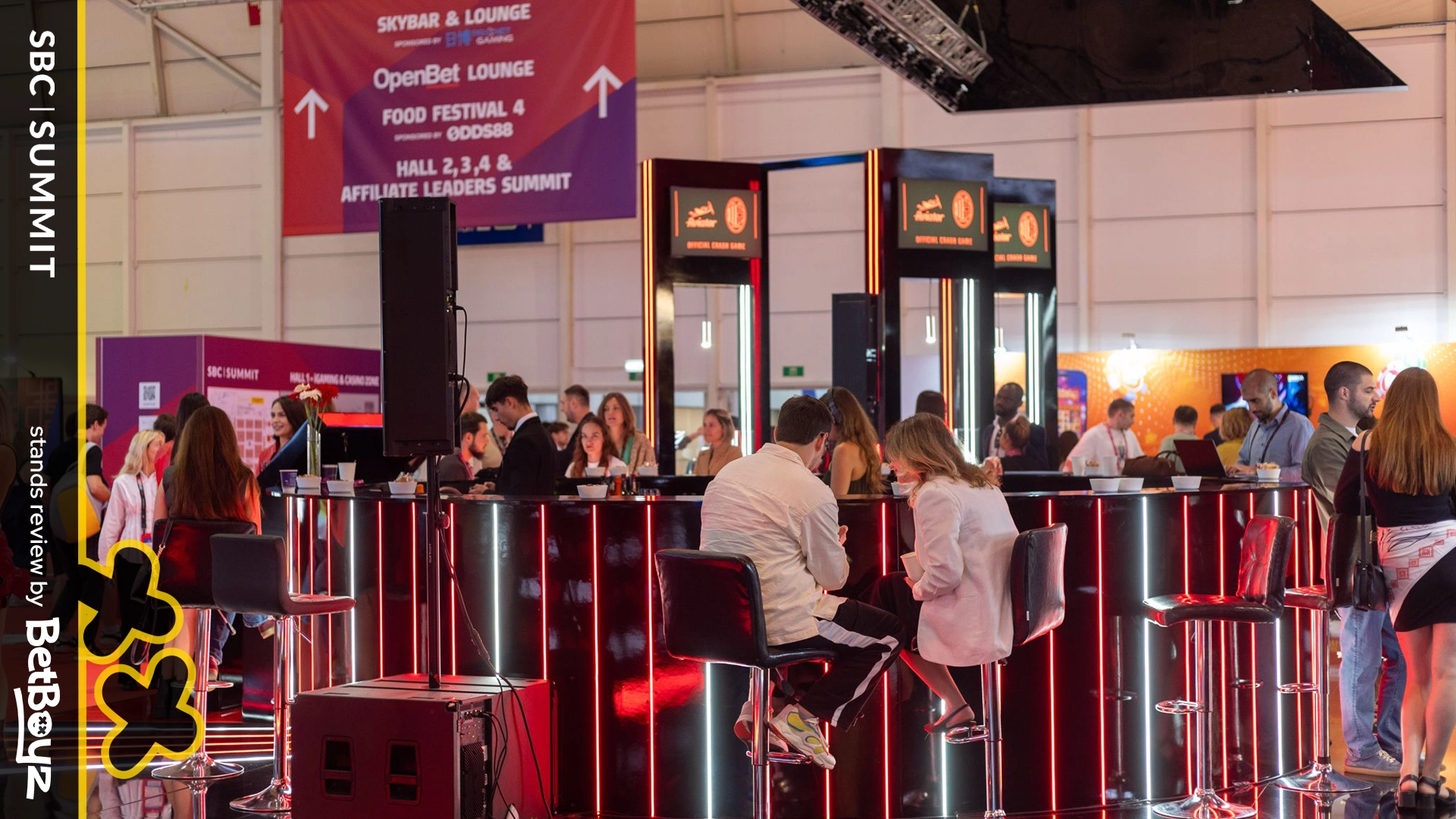
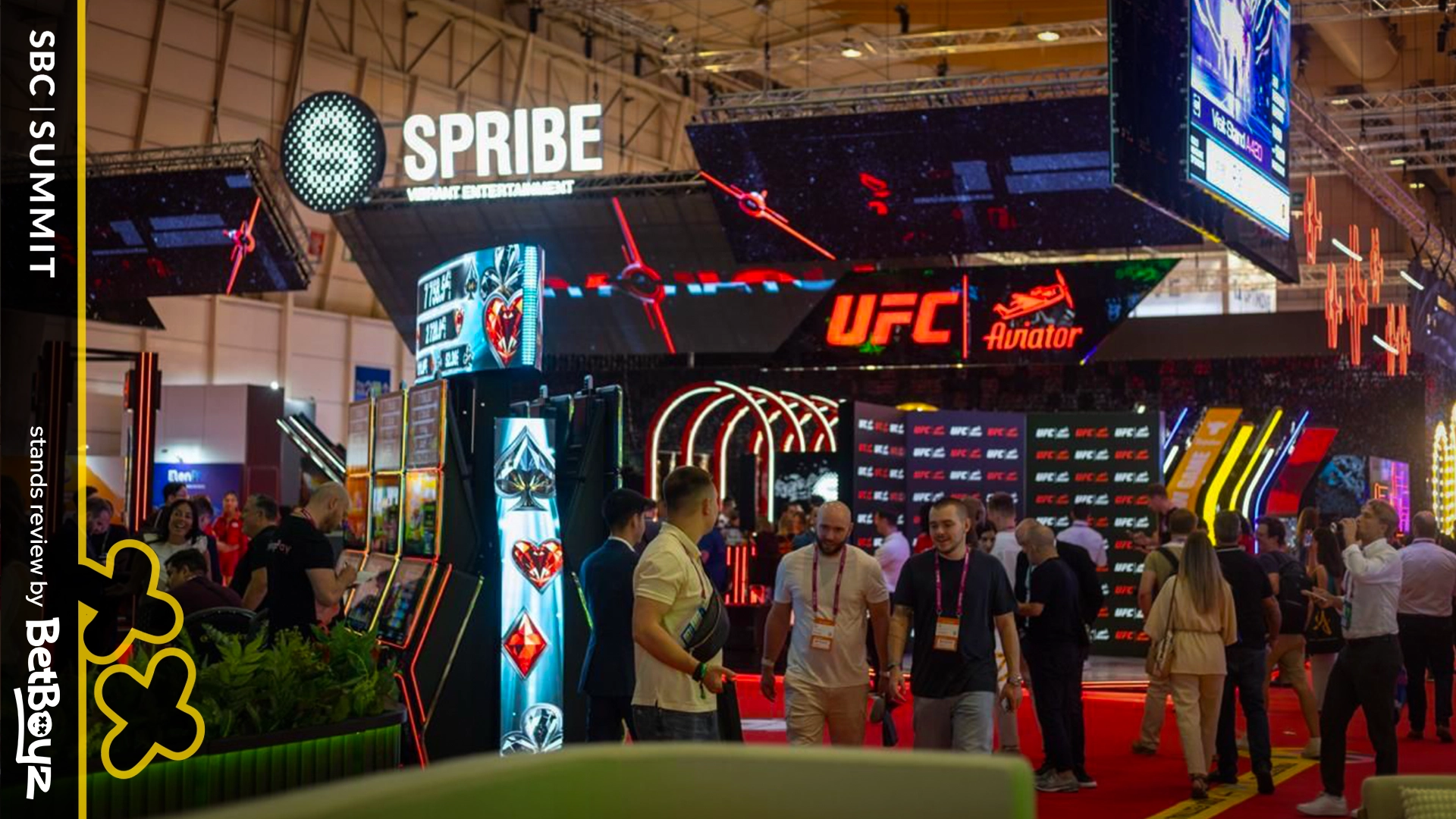
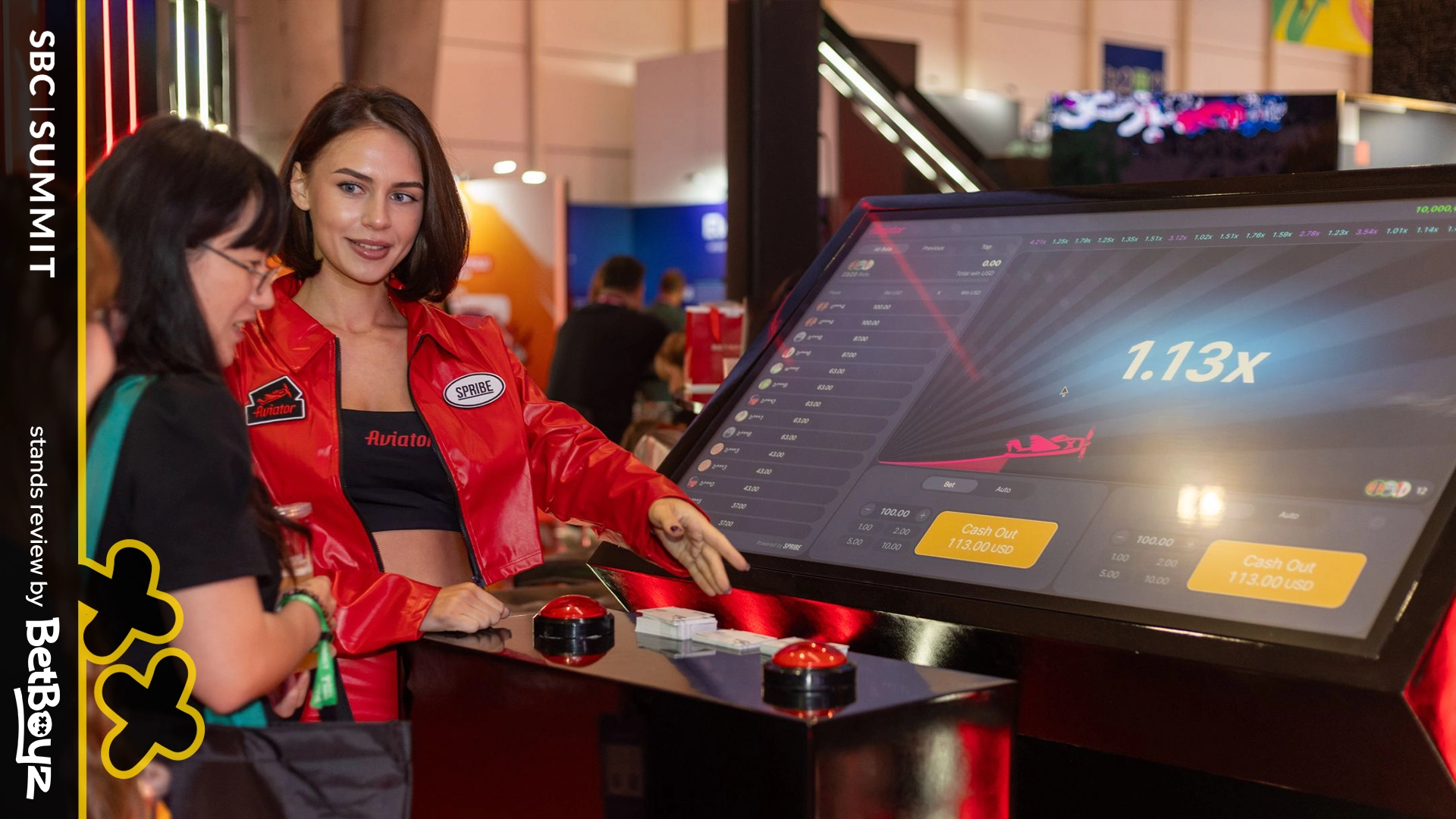
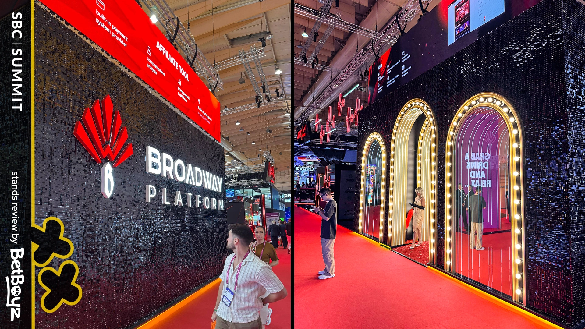
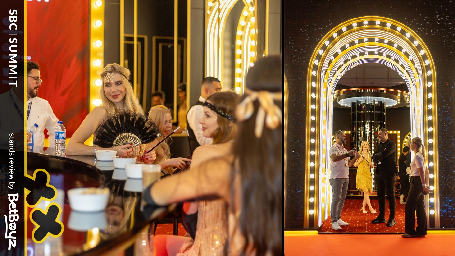
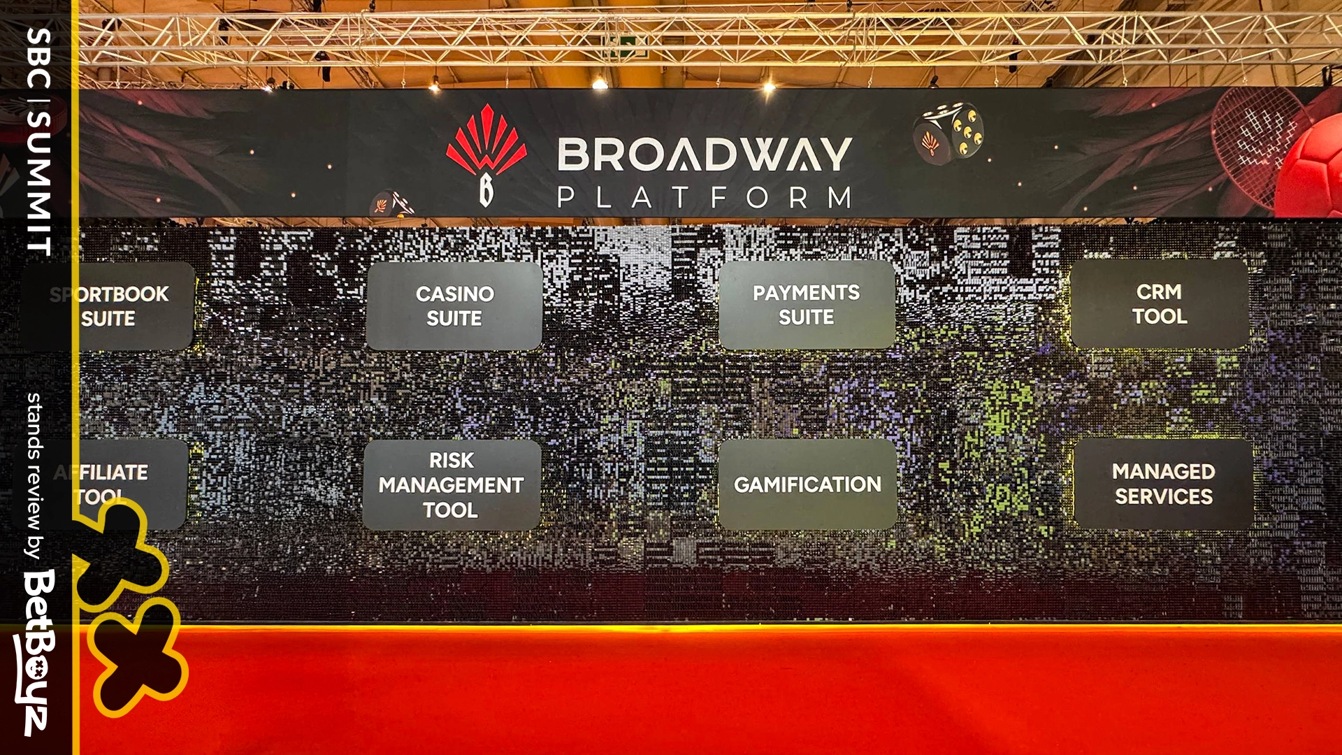
Spribe split their pavilion into two zones: Aviator and Broadway. Same brand, two moods. The contrast between the two was interesting.
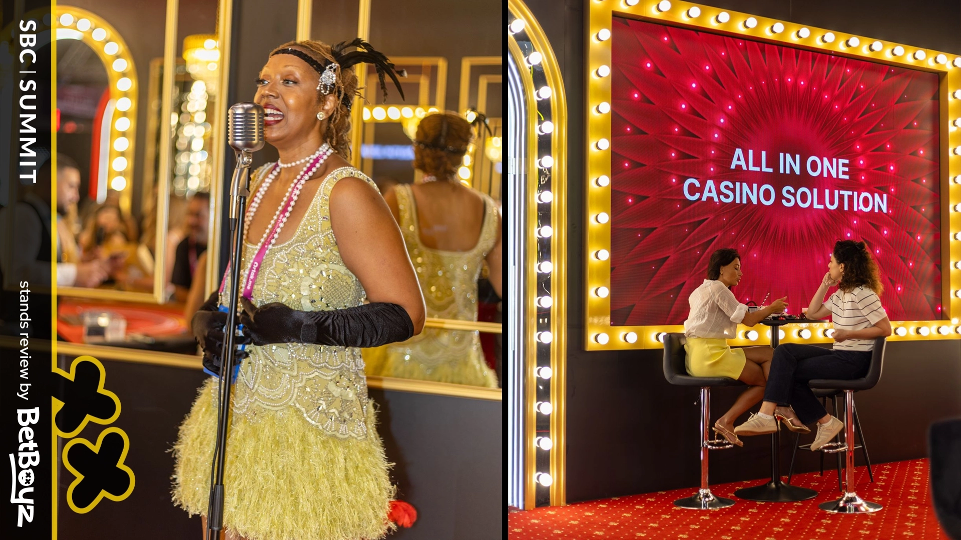
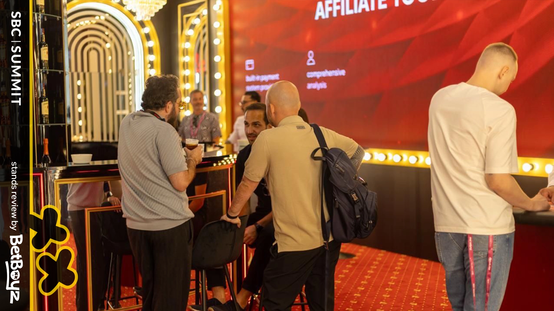
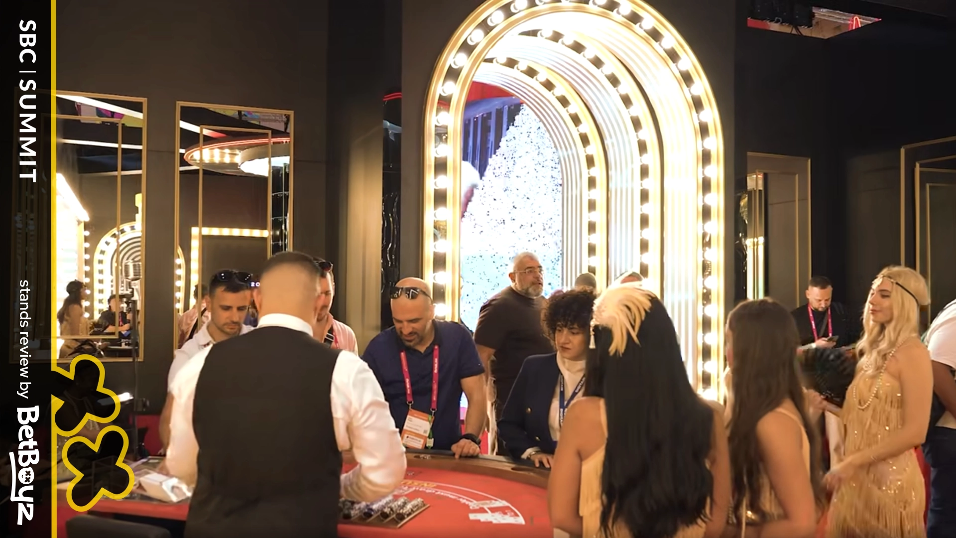
Broadway stole the show. The design was mutually minimalistic and maximalistic, a smart paradox. Minimal from five meters, maximal at 50 centimeters. Nice flex. At first glance, the pavilion looked simple, but on closer inspection, you saw the tiny sparkles covering the surface, catching and reflecting every bit of light in the hall. Glitter with a purpose. When someone walked by, the sparkles waved gently, turning the stand into a living installation.
This attention to detail and atmosphere made Broadway one of the most memorable areas of the entire event. Add to that the retro-style casino arcs at the front, dressed in lights and executed with taste, Broadway achieved a sense of immersion, style, and storytelling.
The Aviator part, on the other hand, leaned on UFC branding with two big screens. It was a reminder that iGaming brand design has to align with the product’s DNA: Aviator is dynamic, unpredictable, and exciting, and with a bit more of that energy reflected in the décor, the stand could have been even more engaging.
For us, this pavilion demonstrated how iGaming events are about atmosphere. By layering small, thoughtful details, Broadway managed to feel premium and playful at the same time. It didn’t scream money; it spoke fluently. It’s a great reminder that in iGaming branding, even minimal elements, when combined with clever lighting can elevate a stand to icon status. Lights are cheap; lighting is not.
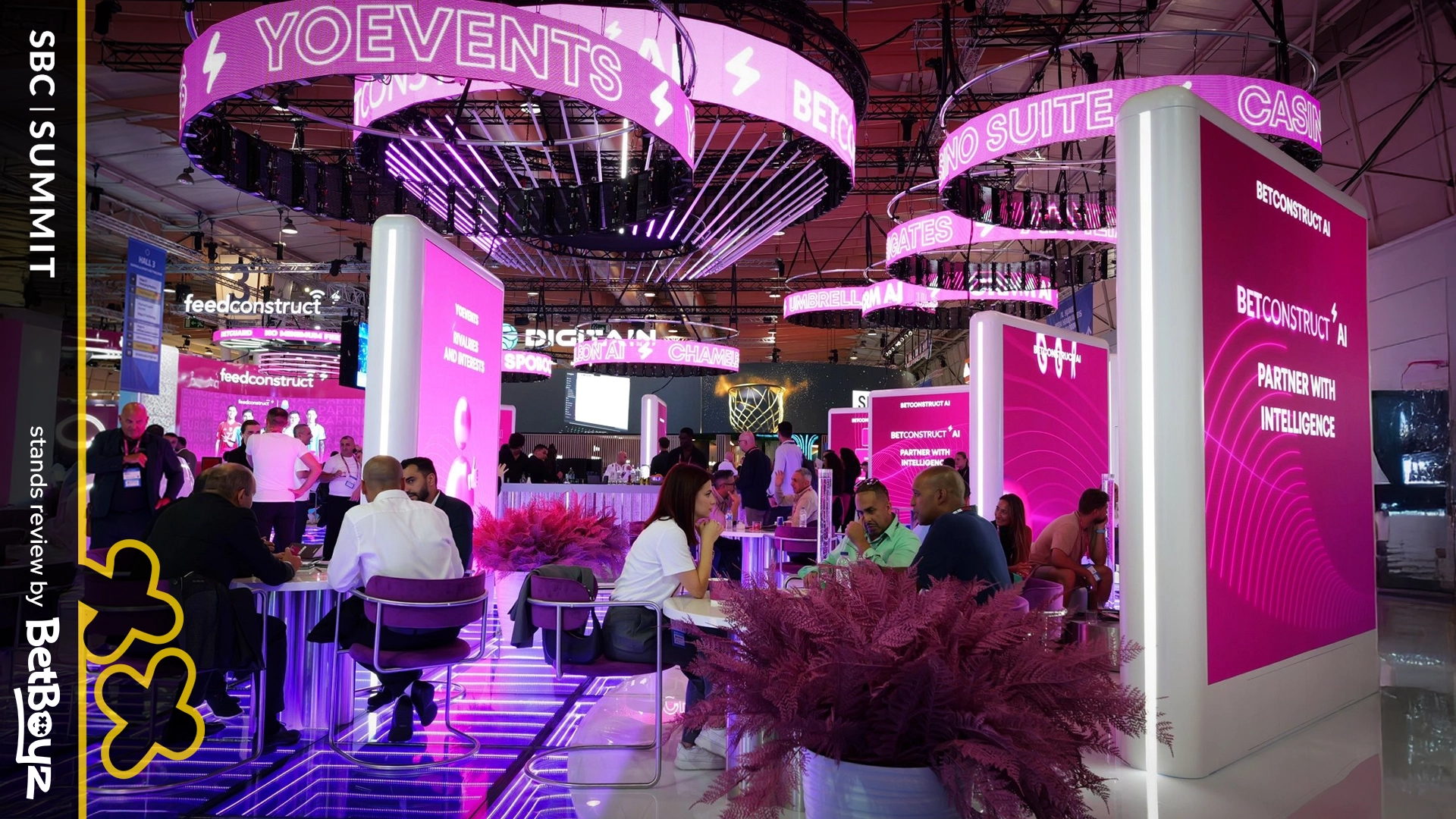
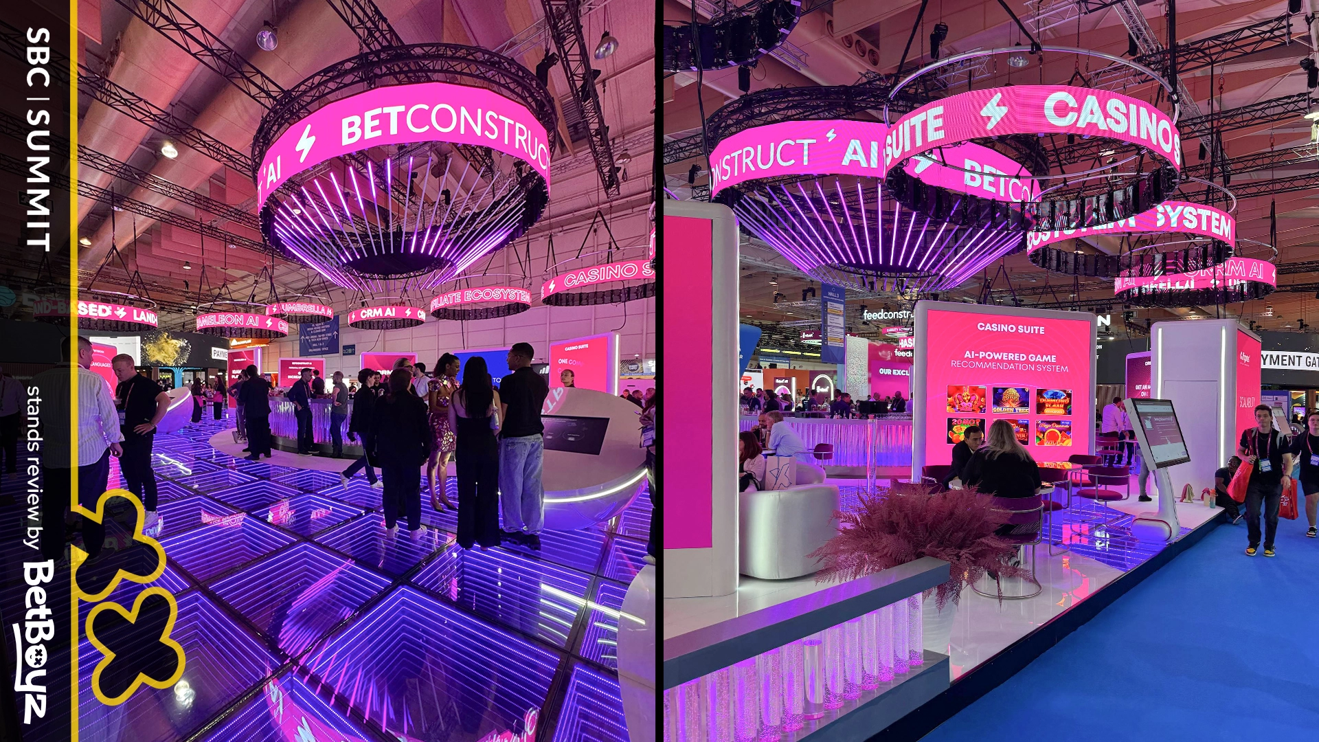
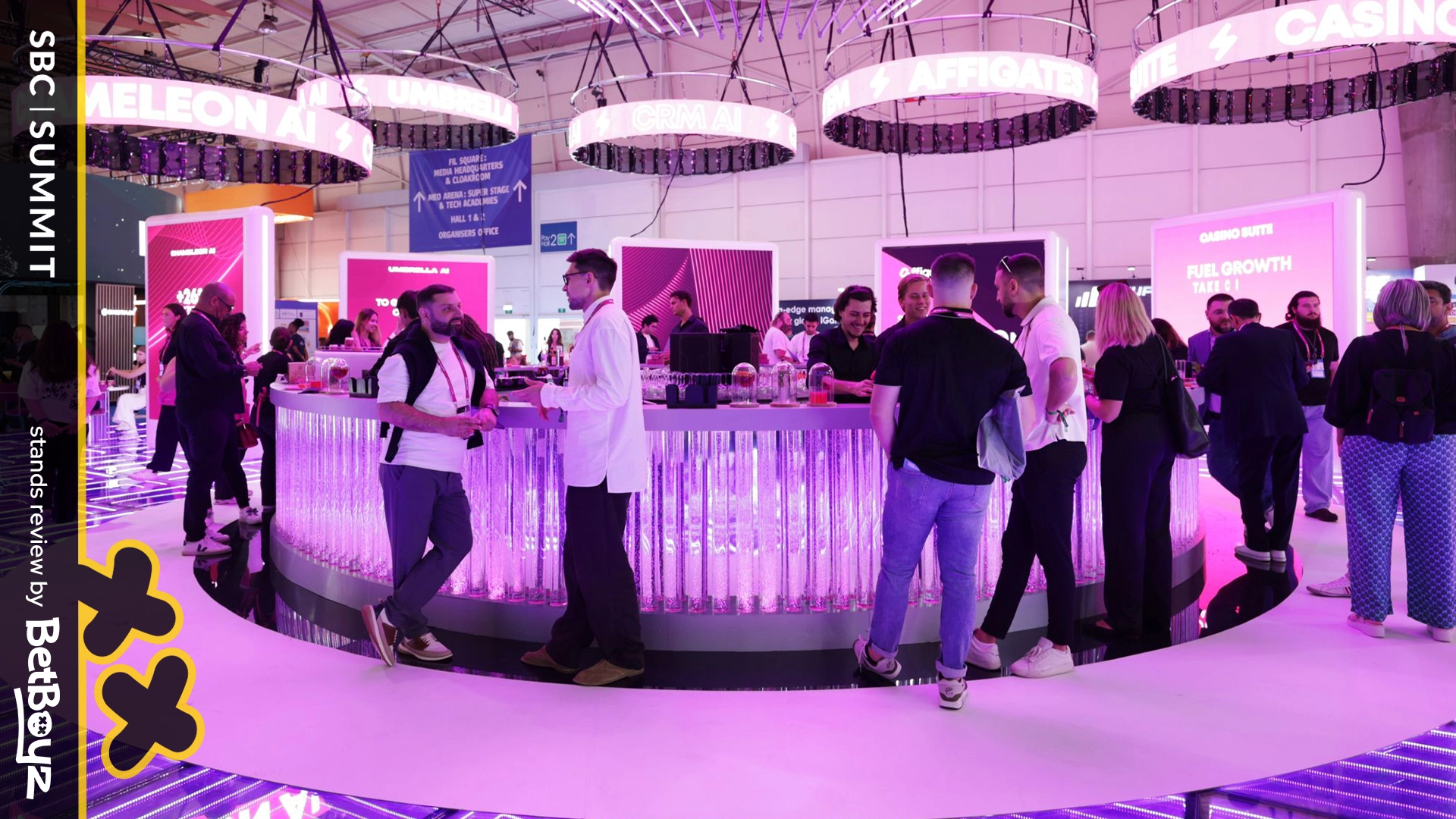
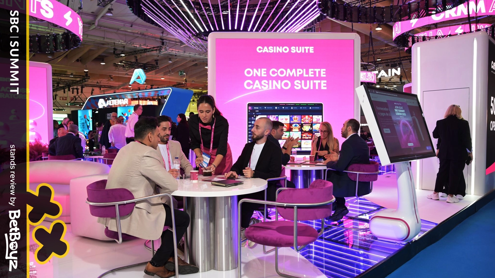
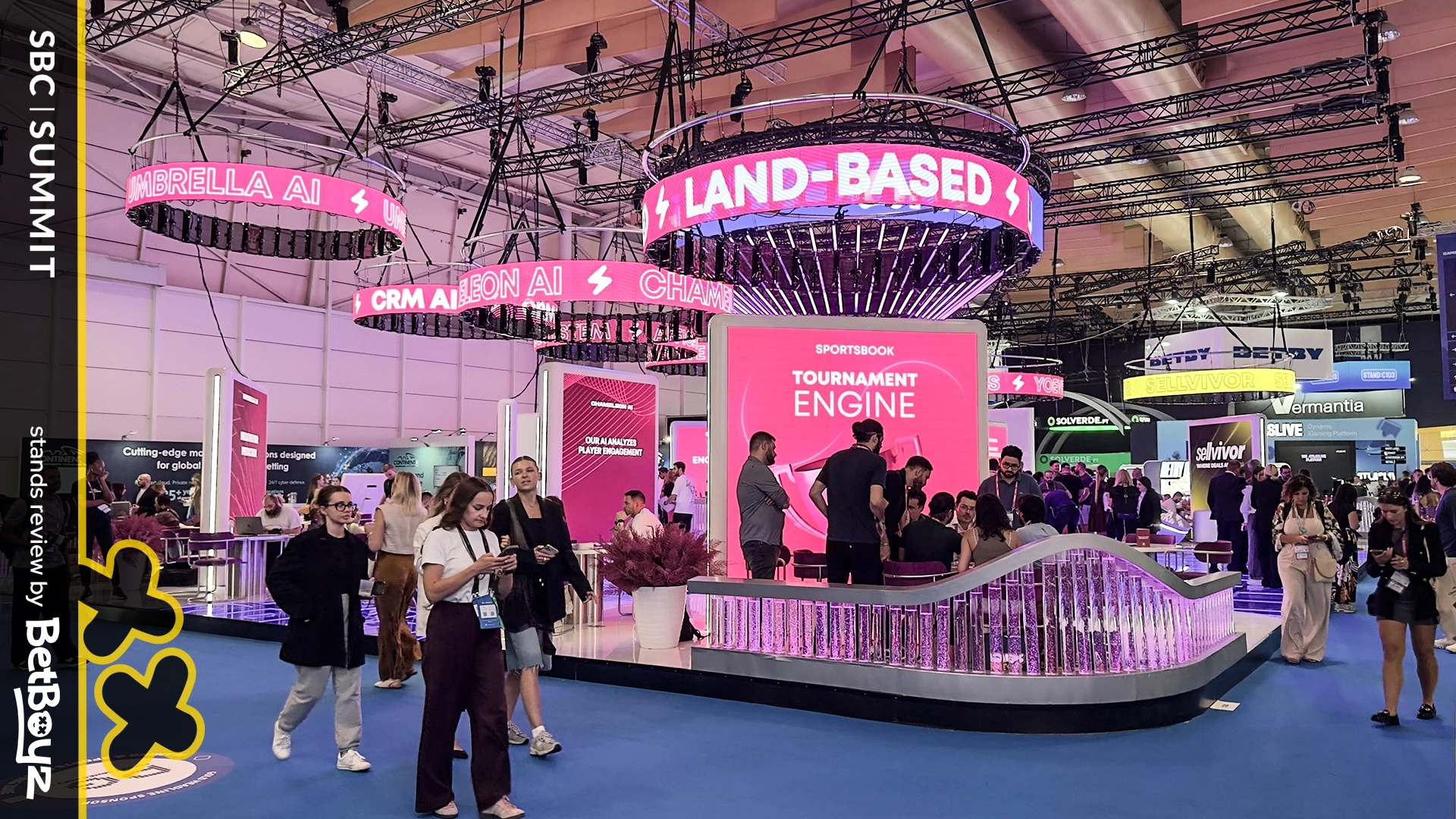
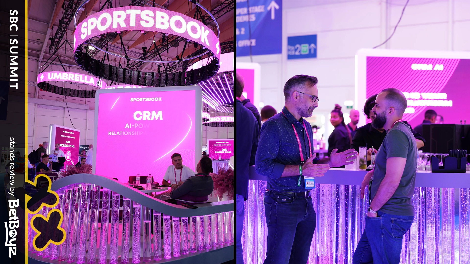
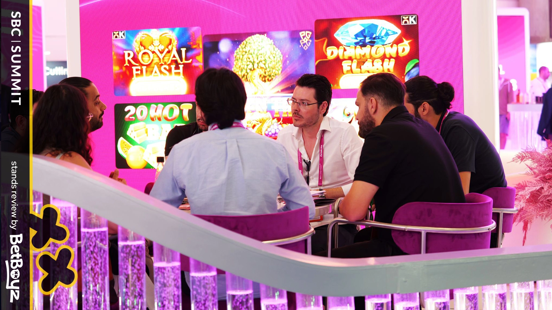
BetConstruct‘s pavilion caught attention from afar with its large circular screens above. It was a smart visibility move, ensuring the brand stood out across the expo floor. With a closer look, the stand leaned more on its overhead spectacle, with less emphasis on a strong land-based anchor.
Adding a strong land-based anchor could have made the experience feel even more balanced, and covering the upper screen’s technical parts would have amplified the effect of an already impressive setup.
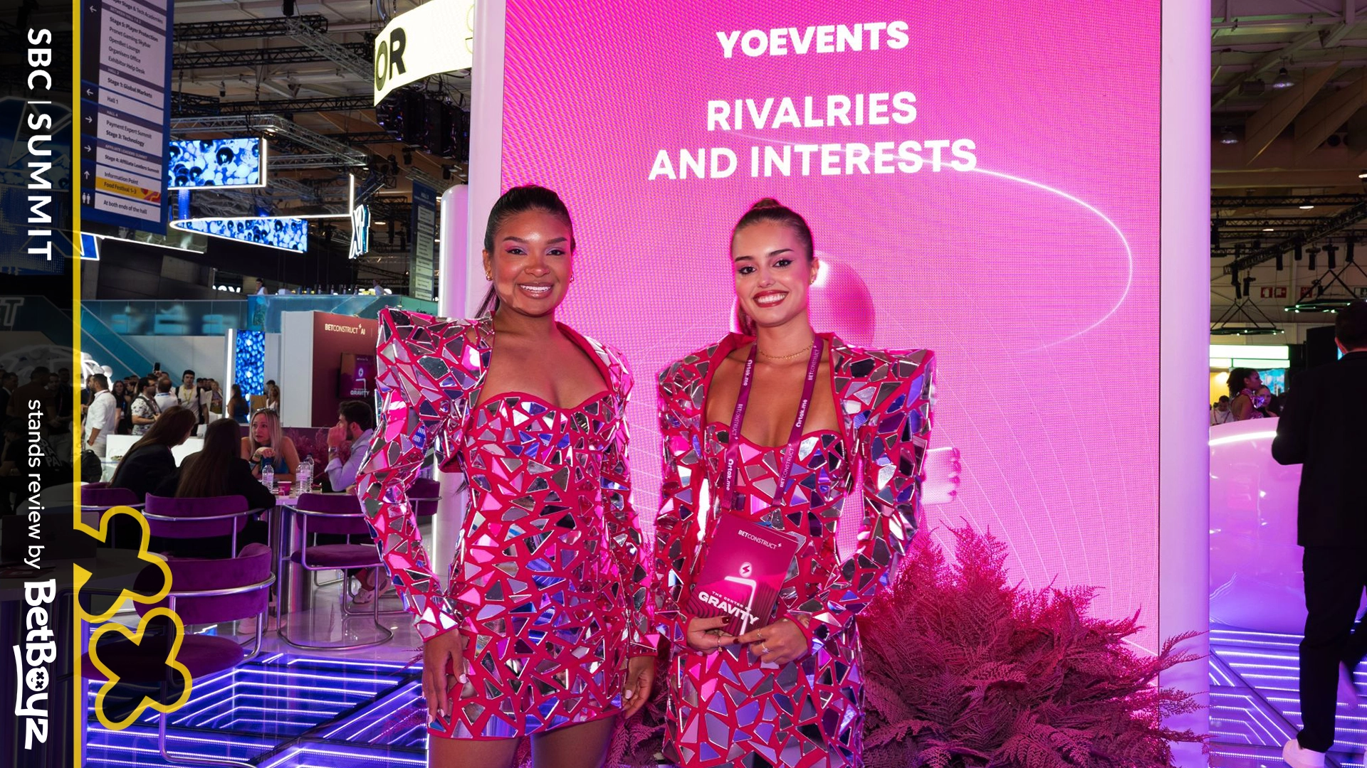
Still, the pavilion had plenty of cool nuances, from bubble flasks to infinity mirrors and glowing circles. These elements created movement, atmosphere, and gave visitors a lot to look at. And, the overall impression was still one of ambition and presence.
In the end, BetConstruct managed to design a stand that was energetic and engaging. It drew people in, entertained them, and showed the brand’s scale and presence, proof that sometimes variety itself can be a statement.
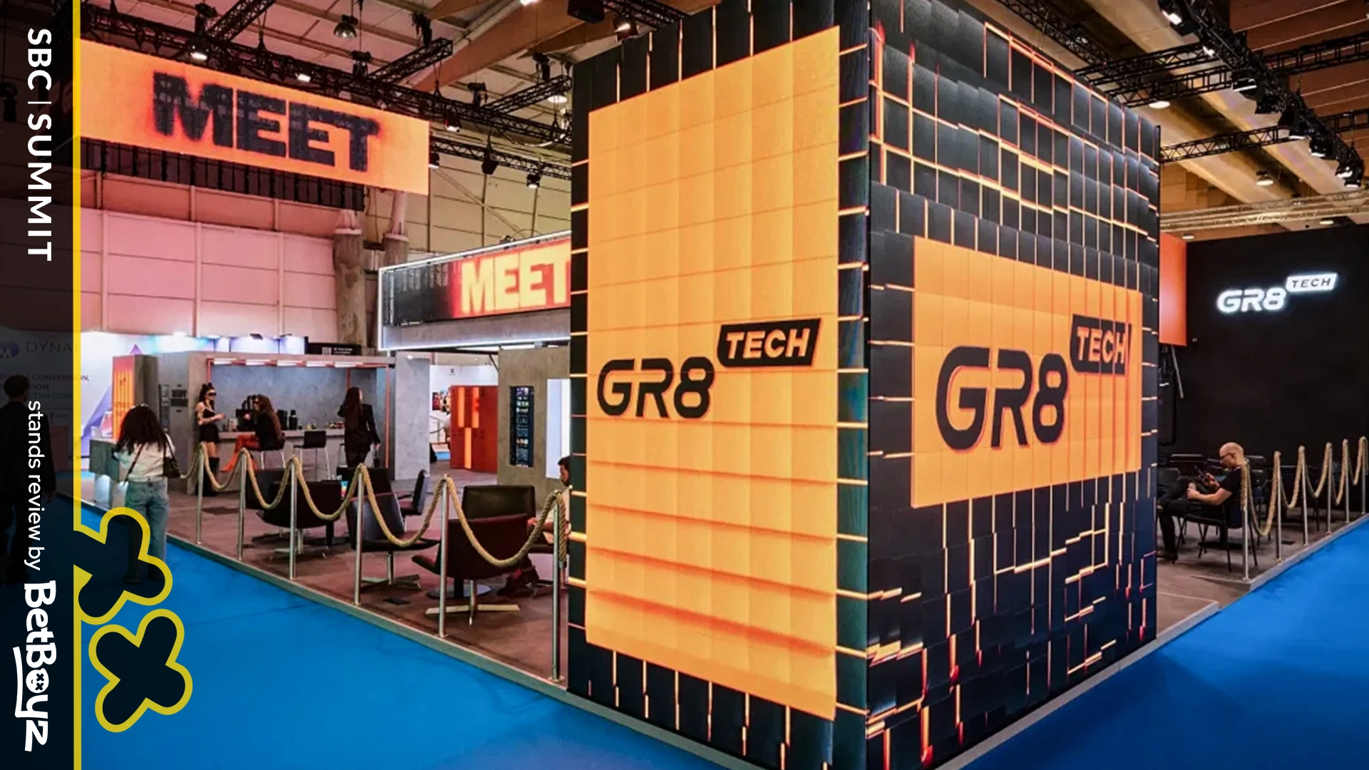
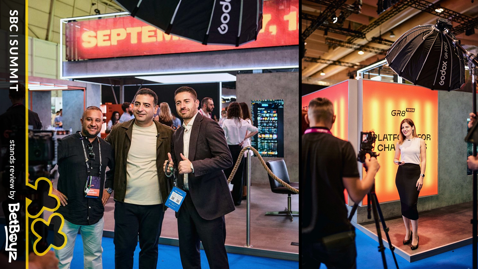
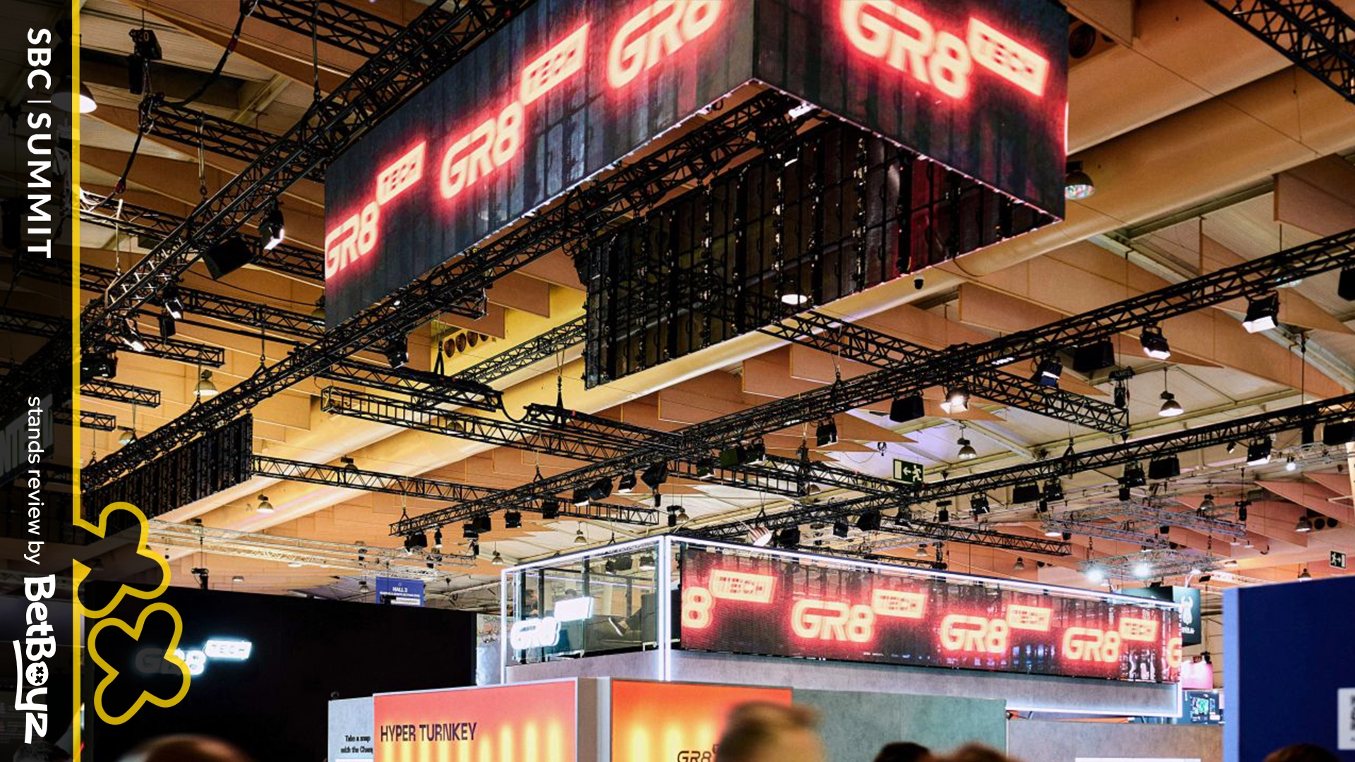
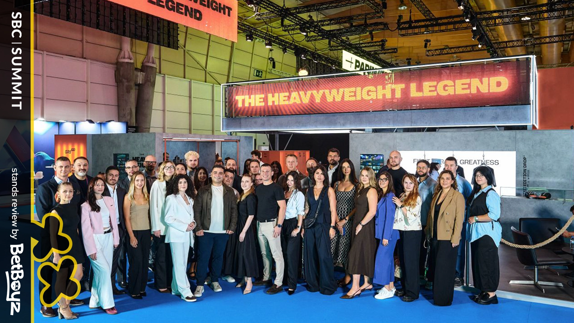
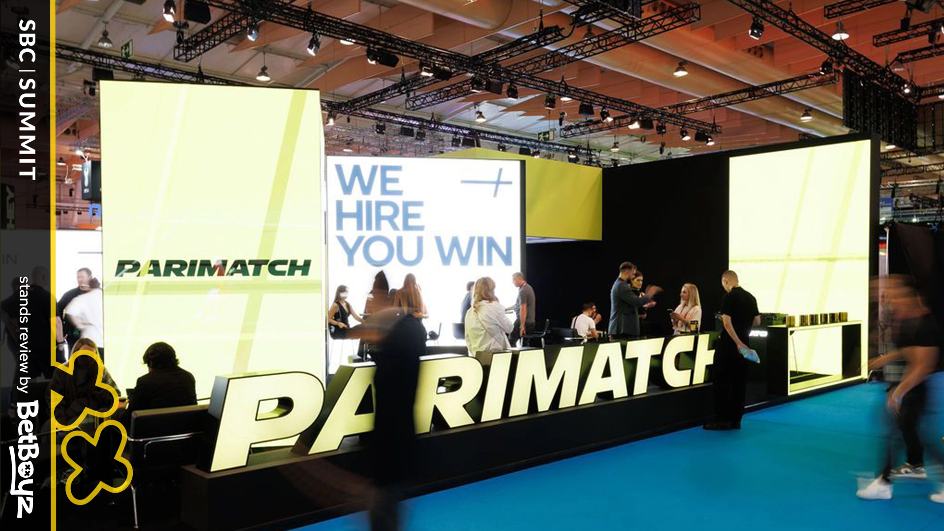
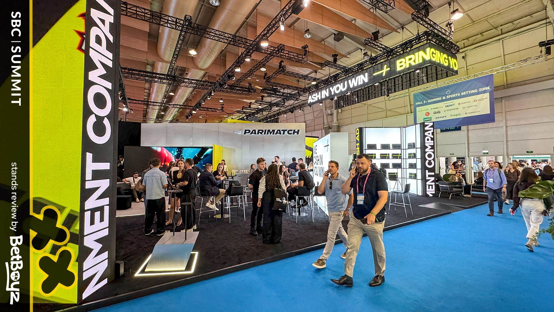
This year, Gr8 Tech and Parimatch went bigger than before, sharing one pavilion and giving themselves the kind of floor space their names deserve. The message was clear: ambition, presence, and growth. And yes, it was bigger, louder, and more noticeable than in past editions.
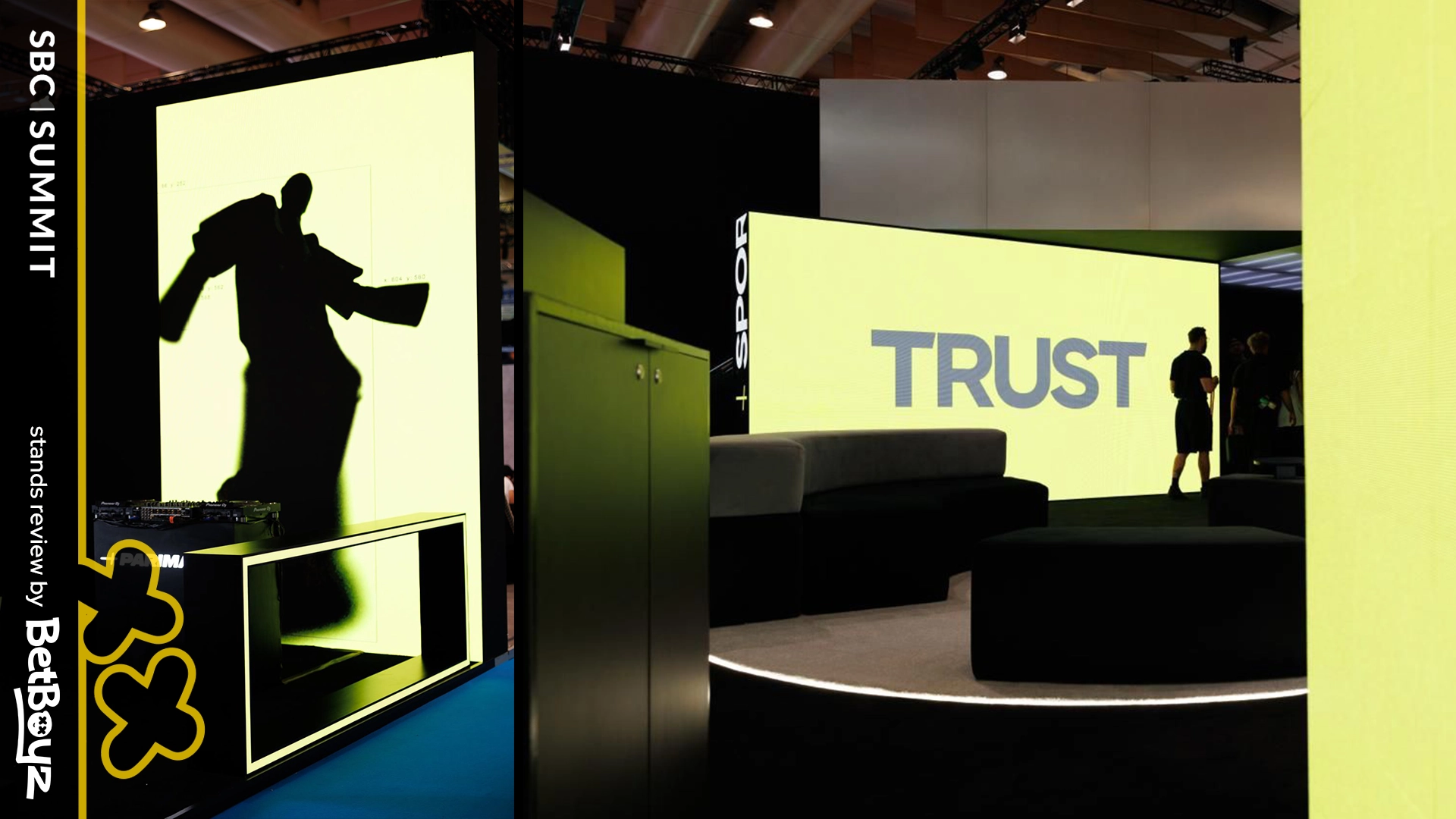
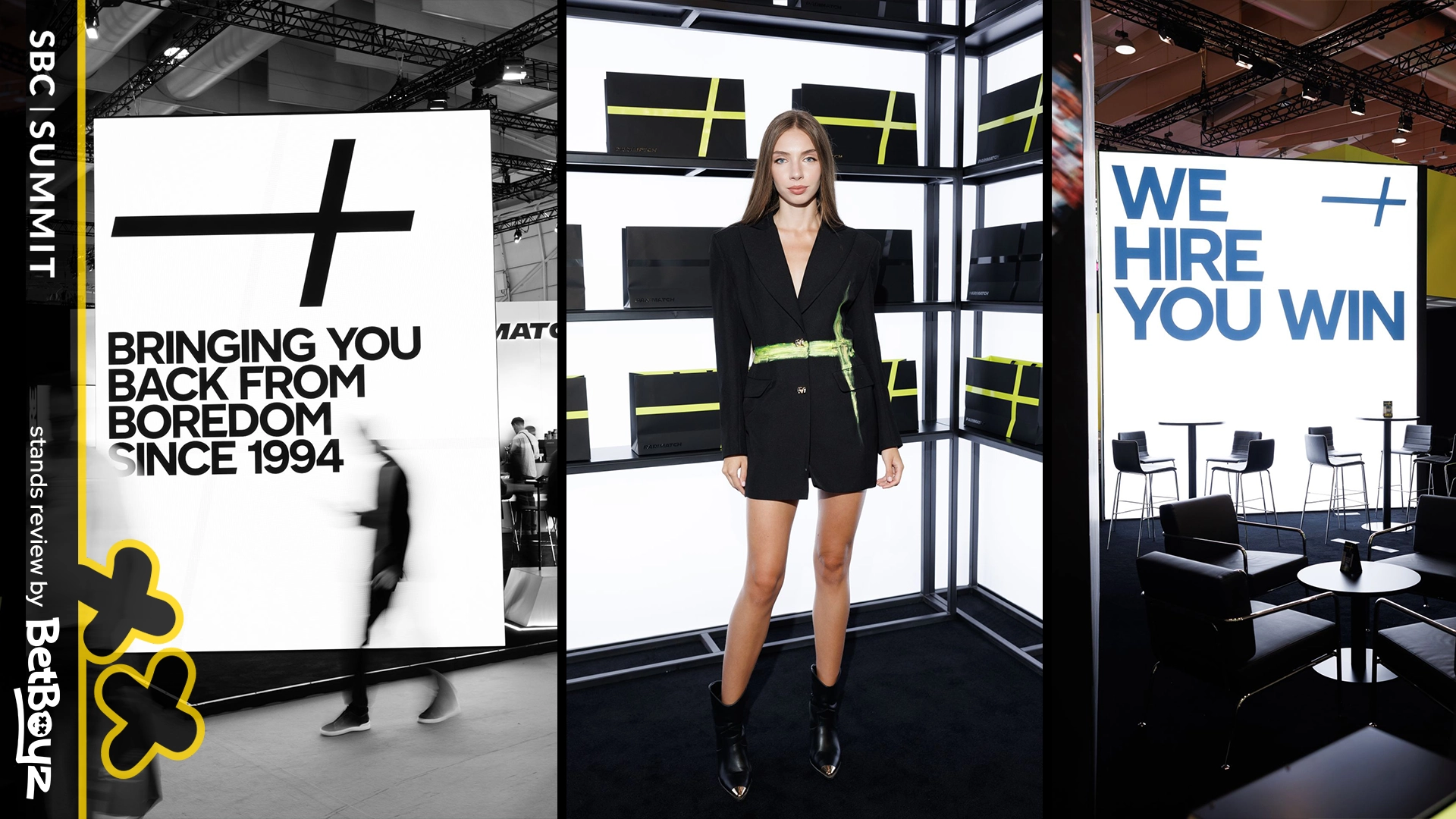
Parimatch leaned confidently into their sport-driven DNA with bold texts and visuals. It was impressive, punchy, and direct in a way that matched the brand’s energy. The only thing missing was a sense of vertical drama. The stand felt powerful on the ground, but could have soared even higher with a few elevated touches to really deliver that “arena” experience.
Gr8 Tech’s contribution added balance to the setup, reinforcing the overall impact and helping the pavilion feel cohesive. Together, the two brands created a unified space that was engaging and visually strong. While the execution was monumental, the ambition shone through, and the step up from past editions was unmistakable.
For online casino brands looking to dominate visually, this was still a big statement: we’re here, and we’re stronger than before.
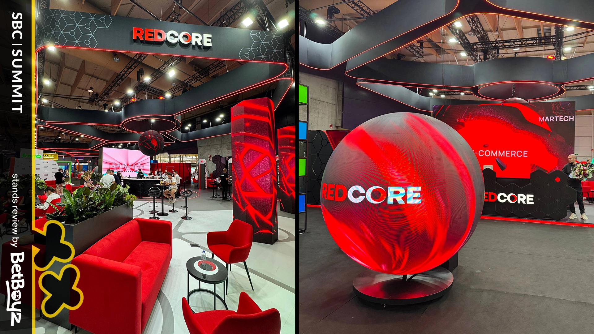
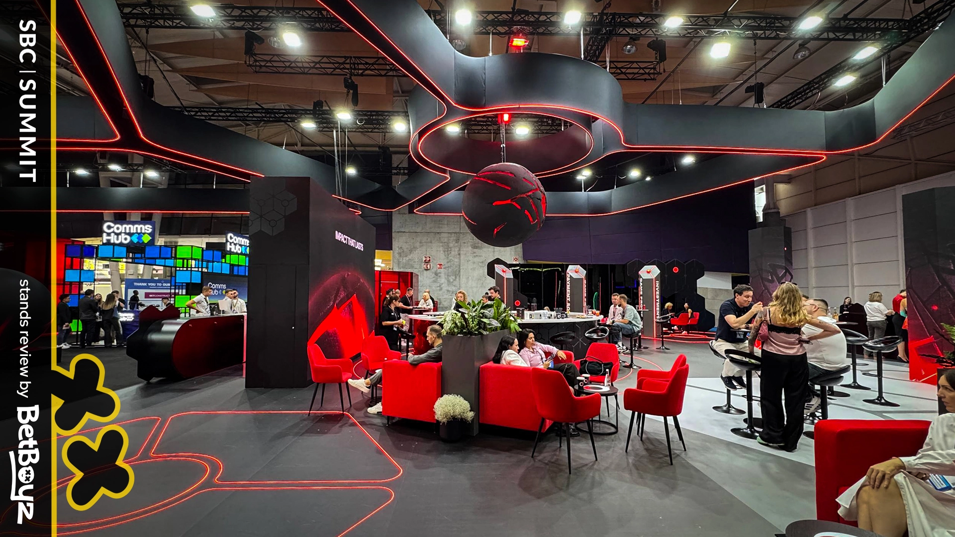
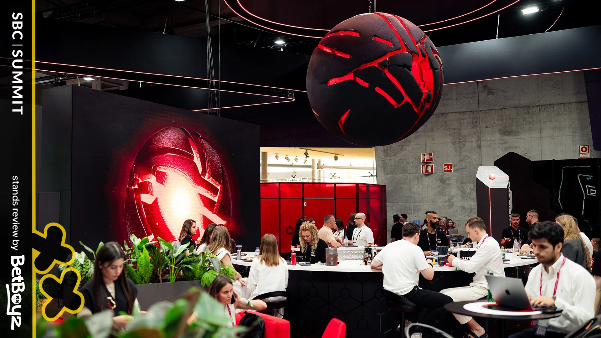
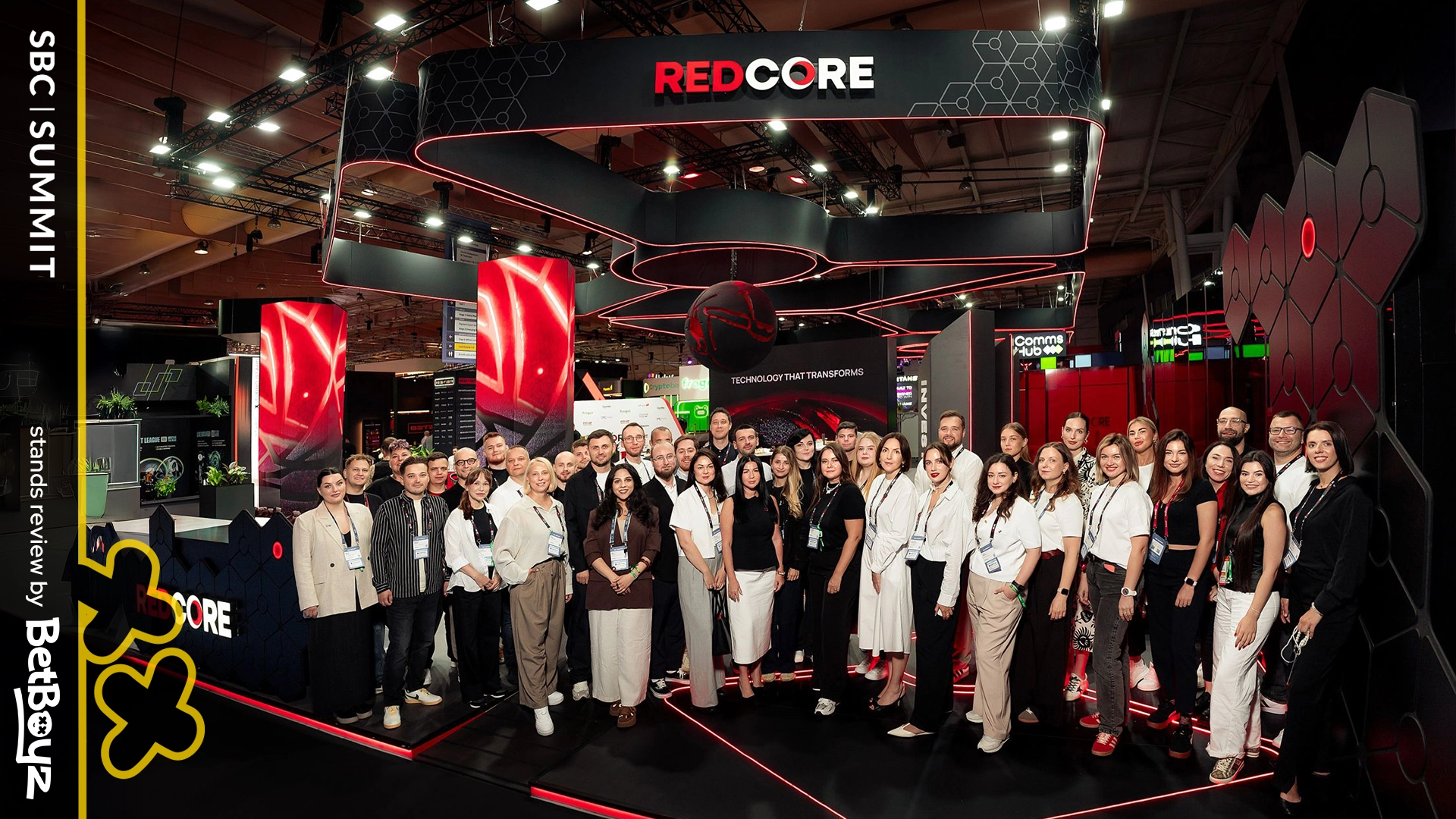
Redcore came to SBC Lisbon with ambition, and, the ball. Literally. Their pavilion featured a massive, glowing white sphere meant to symbolize unity, energy, and connection. Conceptually, smart move. A single element like that can act as both beacon and anchor, especially in the chaos of an iGaming expo stand. Done right, it could have been their lighthouse on the floor.
A slightly different lighting could have done more justice to its potential. With more focused execution, the ball could have stood out as an even more radiant centerpiece.
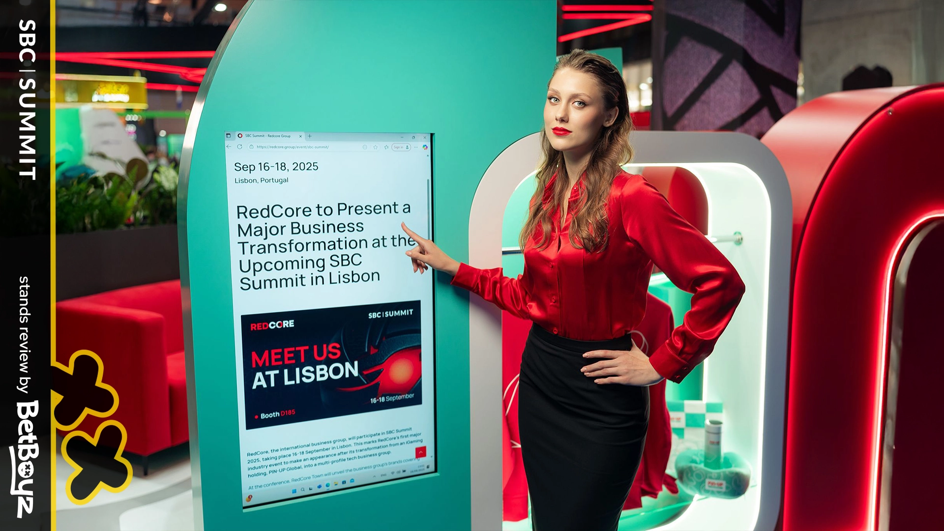
That said, there were details worth noting. The tiny connecting element from above, tying the pavilion together, was a clever touch. It gave the impression that the ball was part of a larger network. It was a subtle metaphor for being part of a wider holding group, which counts giants like Pin-Up in its portfolio. That’s strong narrative thinking.
EGT, Spribe, BetConstruct, Gr8 Tech, Parimatch, Redcore. Six different attempts, six different inspirations.
- EGT demonstrated how focal dominance can define a space, with room to add supporting layers for even more impact.
- Spribe balanced two moods: Broadway impressed with detail and atmosphere, while Aviator kept things straightforward and familiar.
- BetConstruct used layered elements and overhead presence to draw strong attention across the floor.
- Gr8 Tech & Parimatch expanded their scale and energy, with opportunities to amplify the sense of vertical drama.
- Redcore stood out with a strong central idea and impressive size, even if its uniformity across angles kept the experience consistent.
Stand design is an extension of brand identity. Just like a casino logo or UI element, a pavilion tells a story. It can be bold, playful, or subtle, but it works best when it aligns closely with the brand’s energy. Looks matter, but authenticity matters more. When design reflects true brand DNA, it resonates not just in photos but in lasting impressions.
Walking through SBC Lisbon, it’s clear that it’s as much about detail as it is about dominance. Big gestures get the photos; details get the business. EGT showed how a single bold element can capture attention. Spribe reminded us that the smallest touches like sparkles in the air can elevate a pavilion into something magical.
For BetStage, the lesson is simple: great event décor balances scale, detail, and atmosphere. At SBC Lisbon, these six stands proved that when done right, even minimal gestures can create maximum impact. And as iGaming branding specialists, we see every expo as a reminder that a pavilion is a brand stage, a live expression of identity, and a chance to turn an online casino brand into a memorable real-world experience. Not just a backdrop. Your brand. Breathing.
Stay tuned. More stands, more highlights, and more inspirations are coming. The Boyz aren’t done walking the floor yet.

