Branding Elements That Build Your Success Rate at Big iGaming Events
The floors of ICE Barcelona, SBC Summit, SiGMA and other major events are dense, fast-moving environments. Thousands of industry professionals move through them over the course of a few days, making quick decisions about where to stop, who to talk to, and what to remember. In that context, branding is not just the visual layer sitting on top of your commercial effort; it is part of how that effort performs.
This article explores the exact branding elements from high-contrast visual systems to razor-sharp value propositions that cut through the noise.
Why Branding Matters Before Anyone Even Stops at Your Booth
At iGaming events like ICE, SBC Summit, and SiGMA, your booth is not competing with one or two neighbors. It is competing with hundreds of brands in a high-noise environment built around speed, distraction, and visual overload.
ICE’s 2026 Barcelona edition drew a record 62,988 industry professionals, SBC Summit 2025 promoted 30,000 attendees from 130+ countries, and SiGMA positions its events around very large-scale exhibitor and delegate traffic. In halls like that, people are not carefully discovering brands; they are scanning, filtering, and moving. A booth has seconds, not minutes, to register.
A large, well-produced booth is a strong starting point. But when the brand identity is clear and recognizable, the booth does more work passively. People locate it faster, understand it sooner, and are more likely to remember it afterward.
The elements below are what make that happen.
A casino logo that performs well on a website header often needs to be rethought for event environments. Booths demand the logo to function across a very wide range of applications: hanging banners viewed from a distance, LED walls, fascia signage, printed handouts, badges, and social content. Viewing conditions vary significantly, including distance, angle, glare, ambient lighting, and screen resolution. What this means in practice is that a single logo version is rarely enough.
A logo system gives you the flexibility to adapt: a full horizontal lockup, a compact stacked version, a standalone symbol, light and dark variants. Each one is built to hold up in specific conditions. The test at an event is not whether the logo looks refined at close range. It is whether someone can read it clearly in about two seconds from several meters away.
In plain language, contrast is what makes a headline stand out clearly from its background. If you place bright cyan text on a light gradient because it looks futuristic, but people cannot read it from the aisle, the design is underperforming. Event branding has to survive bad conditions, not ideal mockups.
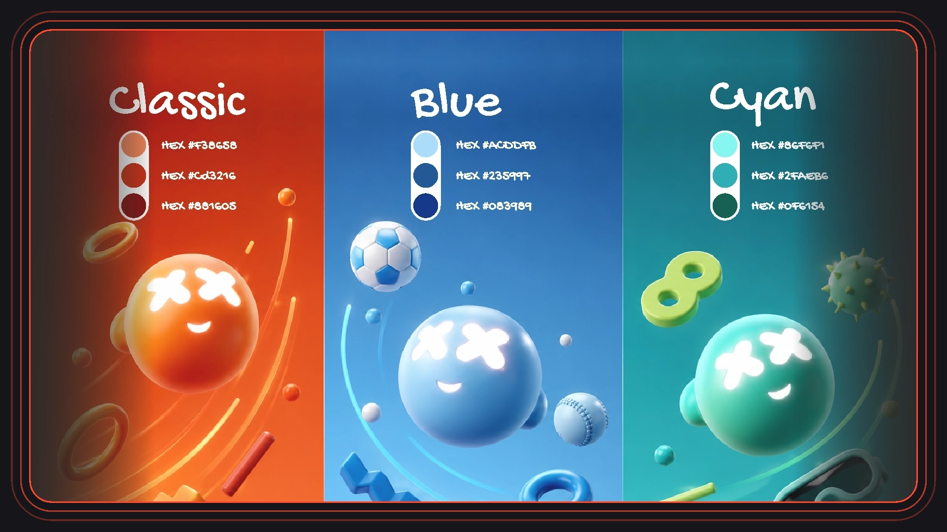
Color is one of the fastest things the eye processes, which makes it one of the most powerful tools for booth recognition and one of the easiest to underuse. A well-structured palette does two things simultaneously: it helps people locate the booth in peripheral vision, and it gives them something to mentally anchor afterward. People often remember the color logic before they remember the casino brand name.
The way to make that work is through discipline: a dominant primary color or palette, a clear secondary supporting set, and consistent contrast rules applied across all surfaces. When a booth uses too many competing accent colors, one on each wall, another on screens, another on print, the palette stops functioning as a system. It reads as decoration rather than identity.
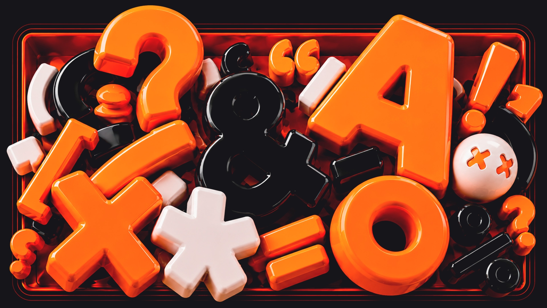
Typography carries nearly everything that needs to be communicated in an event environment: headlines, product names, proof points, directional cues, call-to-action lines, and on-screen content. The way it is structured shapes what people read first, second, and third, and how much they actually absorb.
Large, clear sans-serif fonts, restrained word counts, and generous spacing make that hierarchy legible at the distances and speeds involved at an expo. The point is not stylistic restraint for its own sake; it is that legibility at distance and speed is a different brief from legibility on a screen or page.
A logo and a color palette create the foundation of a brand identity. Graphic motifs extend it into something that feels genuinely ownable. These are the repeatable visual elements: shapes, line systems, framing devices, textures, UI-inspired patterns, and structural backgrounds that appear consistently across walls, screens, printed materials, and merchandise.
What they do practically is create cohesion. When the same set of supporting elements appears across every surface at a booth, the whole environment reads as one unified system. Without them, different assets can feel like they were produced separately, even if the logo and color are consistent. Motifs are what close that gap.
If your booth uses icons in product screens, feature panels, printed materials, or wayfinding, consistency of style matters more than the icons themselves. A unified icon family keeps the visual language coherent: if icons share the same weight, level of detail, corner radius, and stroke style, they quietly reinforce the sense that the brand has been thought through.
Where icon styles mix some sharp, some rounded, some dense with detail, some minimal, the brand system starts to feel assembled rather than designed. It is a small detail in isolation, but across a full booth environment, it compounds.
LED walls, looping screens, animated headlines, and product demos are standard at most large iGaming booths now. Motion, used well, is genuinely valuable: it can direct attention, explain a feature or concept, or add character to the brand experience. Used without intention, it becomes competing noise in an environment that already has plenty.
The useful question to ask about any animated element is: what is this doing? If the answer is directing attention, explaining something, or reinforcing something meaningful about the brand, it earns its place. Motion that exists purely as visual energy tends to make the environment harder to process, not easier, particularly because most people are watching screens in passing, without audio.
These decisions are significantly easier to work through before the event build is in production than after assets are locked and deadlines are close. Reviewing a brand identity as an event system, how all of these elements work together in a live environment, not just how they look in isolation, is worth doing early. It is the difference between solving problems in advance and managing them under pressure.
This is the kind of work BetBoyz does with iGaming brands ahead of major events: examining the full identity as a system, strengthening what needs strengthening, and making sure everything holds together across every surface people will actually encounter.
Create a standout iGaming brand with Betboyz. From logos to brand identity, we ensure your vision resonates with players and leaves a lasting impression.
At major iGaming events, branding shapes the commercial outcome earlier and more directly than most teams account for. It determines whether people notice the booth, whether they understand what is on offer quickly, and whether anything stays in memory once they move on.
The brands that tend to perform best in these environments are not necessarily the loudest or the largest. They are the clearest. Their systems are easy to recognize, their messages are easy to process, and their presence feels consistent from the first glance at a distance to the follow-up conversation. That consistency is what branding at events is actually for.
If you want to sharpen your presence before stepping onto the floor, that is exactly what BetBoyz helps with.