iGaming Logos That Invited a BetBoyz Touch
The BetBoyz creative brain had that itch again. And yes, we tried to ignore it, but failed. Because reimagining things is part of our system, resisting is never really an option.
We picked five iGaming logos that left just enough room to play, then gave them a tiny, composition-level polish, not to “fix” anything (they’re already strong), but to see how they’d behave with a bit of extra balance, spacing, and UI discipline.
Below, you’ll find the originals alongside our versions, along with a quick breakdown of what we tweaked and why.
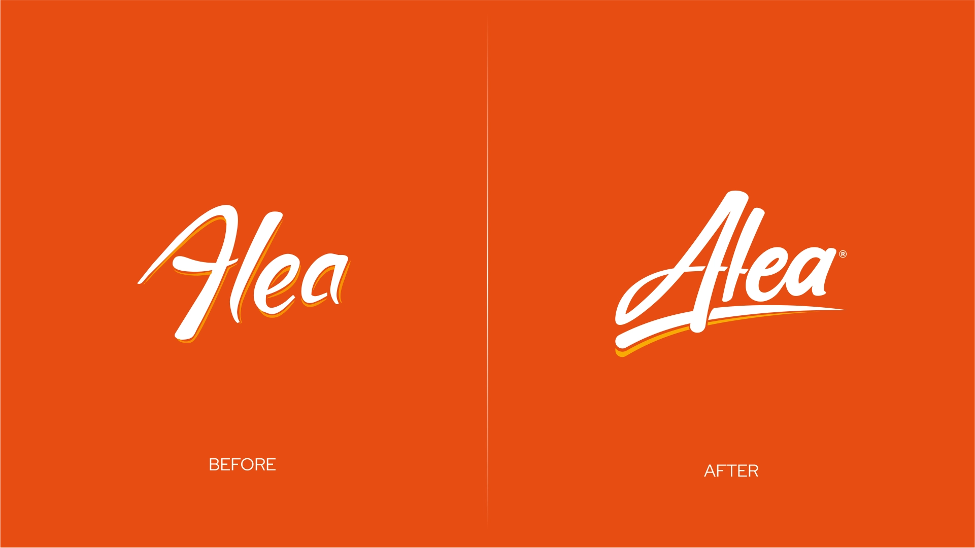
Alea operates quietly as a behind-the-scenes aggregation powerhouse, transforming casino game portfolios through a single, performance-focused integration. By replacing dozens of provider connections with one clean entry point, it helps casinos run smoothly, scale faster, and keep complex game ecosystems under control. Players may not notice the logo: product and design teams like ours definitely do.
We haven’t changed the feel. We just gave it a base, so it stops floating emotionally.
The existing script logo already gets the character right, so no dramatic redesign is needed. It’s elegant, memorable, and feels refreshing compared to the industry’s heavier, more block-minded logo choices. So this wasn’t about rewriting anything; it was just about helping the typeface feel more comfortable.
We mainly focused on improving readability and giving the logo a stronger visual “base,” grounding it, so it feels less like it’s floating and more like it actually belongs inside structured interface layouts. Along the way, we softened some of the sharper, thinner elements (they tend to work against clarity and affect recognition).
Same character, better manners.
- Gently rebalance the script strokes so the word holds together a bit more consistently at smaller sizes (because UI does not care how pretty your curves are).
- Added a supportive underline swoosh to give the logo a steadier “base” on cards and banners, more like a finishing touch than a new concept.
- Cleaned up micro-spacing and flow so the logo reads quickly in a crowded partner section without losing its elegance.
- Kept the same handwriting identity, just made it sit a little more confidently in interface layouts.
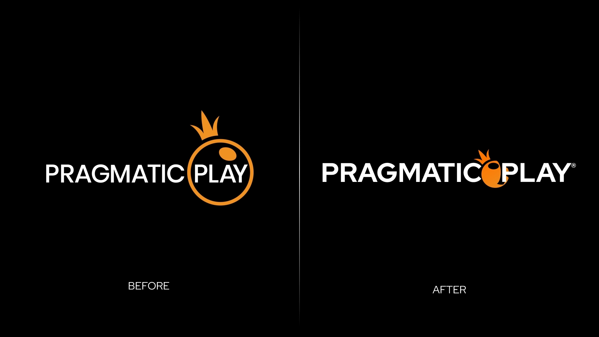
Pragmatic Play is a true iGaming heavyweight. Its logo sits next to some of the most-played slot titles in the industry, including Sweet Bonanza and Gates of Olympus, meaning it gets constant, high-visibility exposure within real casino UI.
We didn’t go in with scissors, more like a ruler.
The original Pragmatic Play logo already has a strong foundation, so our focus stayed on composition. Clean typography paired with the instantly recognizable orange symbol: the clear main character, even if its exact identity remains open to interpretation. It performs beautifully on dark backgrounds, players trust it, operators rely on it.
The main move was rebalancing the relationship between the logo and the symbol, giving each element more breathing room while making the overall lockup feel tighter and more intentional.
When we looked at it through a BetBoyz lens, we felt it was one of those logos that deserved a tiny composition tune, as its idea is worth polishing for product use.
- Evented out the proportions so the orange symbol still acts the main character, but now with the whole logo feeling like one unit.
- Made the lockup more compact so it fits neatly in the small spaces casinos use for logos, like the top bar, the list of providers, and little logo boxes, where space is limited.
- Refined spacing between elements so the logo keeps its clarity when it’s small, sitting next to 20 other logos competing for attention.
- Kept the same signature idea (orange crown plus logo), and just made it better behave on-screen, because UI rewards discipline.
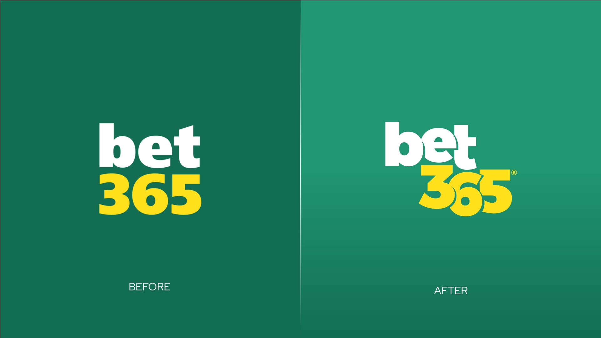
Bet365 is one of the biggest global sportsbook brands, known for its in-play experience and live streaming. And yes, it also runs a casino offering with slots, live dealer games and more. It’s not a brand that needs introductions; it shows up, and everyone already knows who it is.
We left it iconic. We just gave it a little posture.
The original bet365 logo is already almost unfairly functional: simple, bold, readable, and instantly recognizable at practically any size (no jealousy, just admiration). So we didn’t go hunting for a new concept. We stayed in the territory of micro polish: tightening the lockup and giving the typography a touch more energy and passion, without messing with what makes it bet365.
The main idea was giving the font a uniqueness by doing it right justice, given this is no other than bet365’s logo font. We also tried making the lockup feel more unified and intentional in compact UI placements, where spacing and alignment can make even iconic logos feel slightly accidental.
- Played lightly with the typography feel so the “365” has a bit more energy and style, while staying unmistakably bet365.
- Tightened the lockup so “bet” and “365” behave like one shape.
- Typography uniqueness by giving it style.
- Kept the same colors and core structure, just upgraded the on-screen presence by a notch.
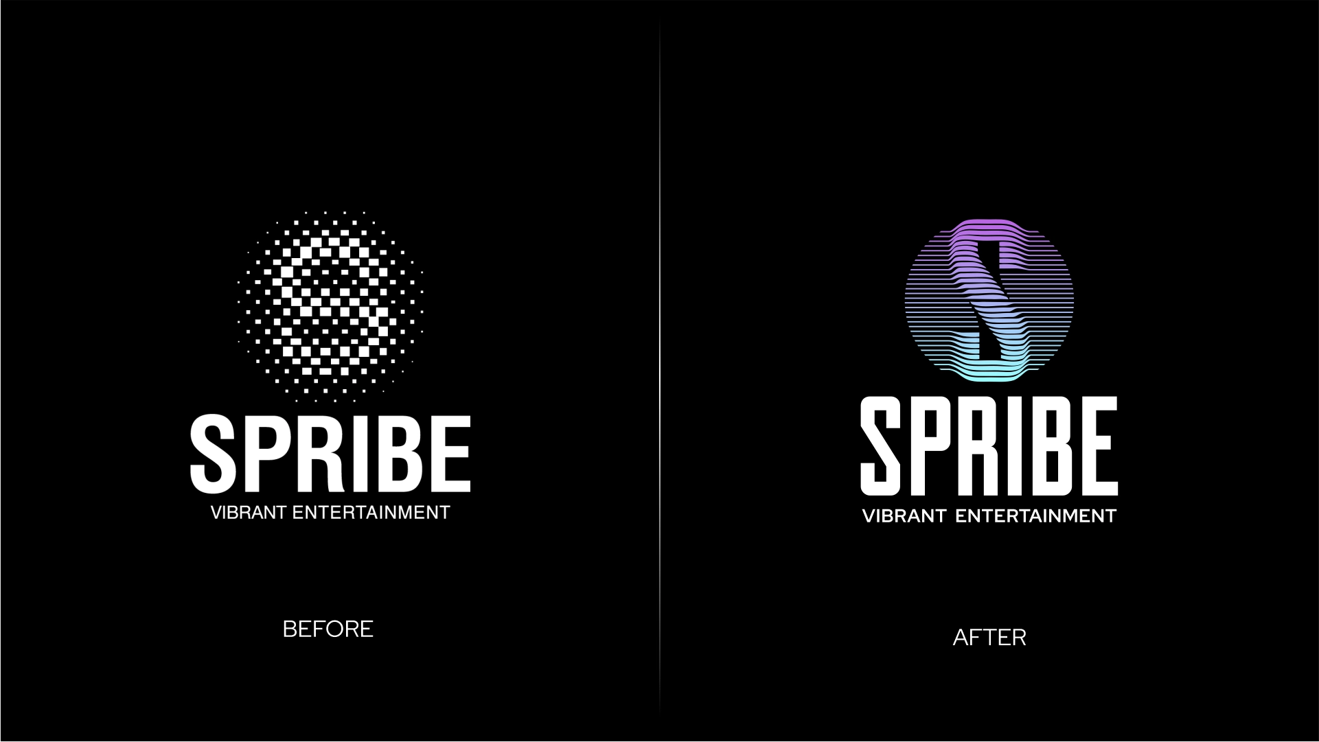
Spribe is strongly associated with crash-style content, with Aviator standing as one of the genre’s most recognizable and widely played titles worldwide. This logo lives in fast, high-contrast environments where everything competes for attention, so clarity isn’t optional; it’s survival.
No upgrade, no drama, just our take.
The original Spribe logo already communicates its world well: strong digital attitude, a distinctive icon, and a clear sense of connected components. That sense of unity is part of the brand’s DNA, so our goal was never to replace it: just to polish it. In crowded interfaces, texture and fine detail are usually the first things to disappear, so we focused on strengthening what holds up under pressure.
- Shifted the symbol concept toward a cleaner monogram (“S”) that keeps the modern vibe but reads faster in tiny placements.
- Moved from detailed texture to a stronger silhouette so the icon stays recognizable when scaled down or shown on busy UI.
- Kept the logotype stable and familiar, so the overall identity still clearly reads as Spribe.
- Introduced a controlled pop of color (a very BetBoyz move) to give the mark a bit more presence without overpowering the interface.
- Achieved a subtle sense of depth and 3D presence using purely 2D graphics, adding visual energy without relying on fragile detail.
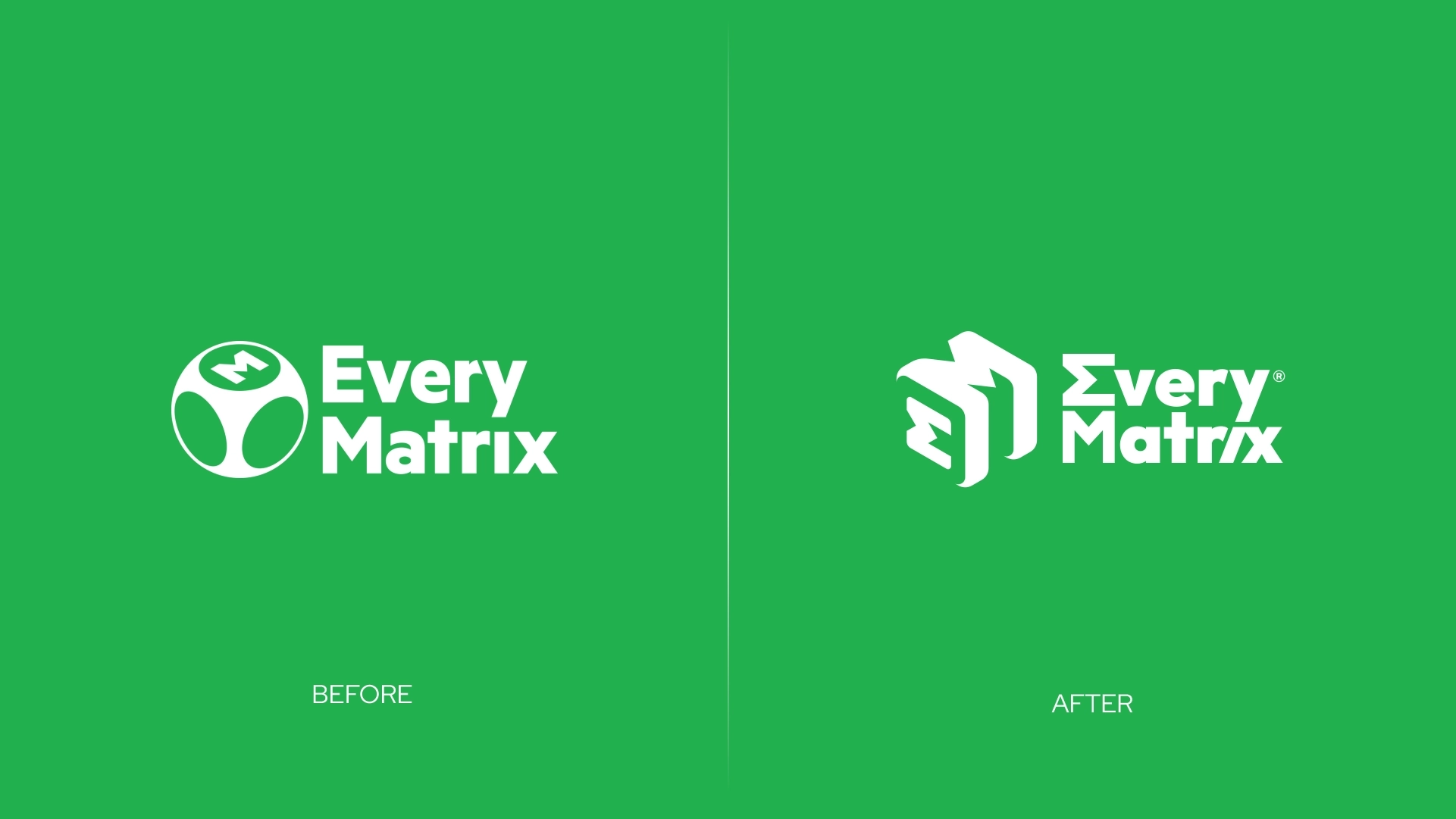
EveryMatrix is a major iGaming technology provider behind platform infrastructure, including CasinoEngine (casino platform), SlotMatrix (casino content aggregation), and OddsMatrix (sportsbook/data solutions). This is “grown-up iGaming” territory; it needs to look structured, stable, and like it’s perfectly comfortable living inside dashboards, admin panels, and, yes, spreadsheets.
Same brand energy, just looking as structured as it sounds.
The original EveryMatrix logo already feels trustworthy: a clean logotype and a symbol that suggests systems/network logic. Our focus stayed on sharpening the icon’s shape language so it reads quicker and holds up better across dense product environments like dashboards, headers, compact grids, where clarity and structure matter more than decorative complexity.
The main intent was pushing the symbol toward a more geometric, monogram-like form with cleaner edges, so it stays crisp and instantly legible when space gets tight.
- Explored a more geometric, monogram-like symbol so it reads quicker and stays crisp in dashboards, headers, and compact grids.
- Clarified the icon’s shape language with cleaner edges and a more defined structure, while keeping the same brand tone.
- Rebalanced icon-to-logo proportions so the lockup feels steadier in horizontal placements.
- Kept the color and overall identity intact: same concept, just tuned to behave more smoothly across modern screens.
This wasn’t a grand redesign mission; it was just a familiar BetBoyz design instinct kicking in. We spend a lot of time around iGaming brands, so we started wondering how a few already-strong logos might look if they were shaped through our own lens. Not to fix anything, but to see how small composition choices could shift the overall feel.
Each logo sparked a different take:
- Alea: premium handwritten feel, more confidence.
- Pragmatic Play: iconic orange symbol, calmer balance.
- Bet365: unmistakable as ever, with a touch more character.
- Spribe: clarity first, without losing its digital edge.
- EveryMatrix: crisp, structured, and comfortably technical.
That’s our take. No fixes, no redesign drama, just BetBoyz doing what we do best: reimagining solid ideas our way and seeing how far small decisions can go.
Now, excuse us while we go question the logos that actually asked for it.

